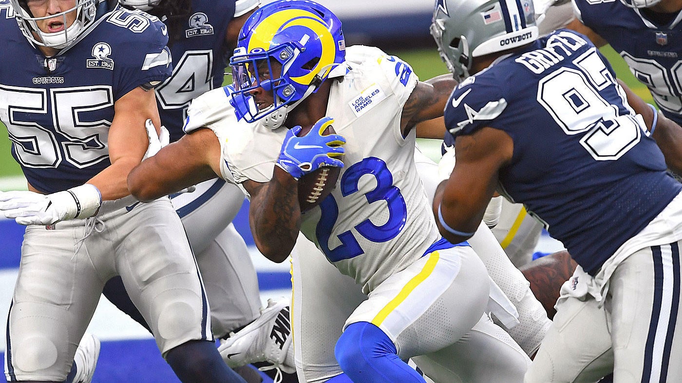
Looking at 2020 uniforms
- Thread starter GoodBadUgly
- Start date
-
To unlock all of features of Rams On Demand please take a brief moment to register. Registering is not only quick and easy, it also allows you access to additional features such as live chat, private messaging, and a host of other apps exclusive to Rams On Demand.
You are using an out of date browser. It may not display this or other websites correctly.
You should upgrade or use an alternative browser.
You should upgrade or use an alternative browser.

They grew on me..still think they look to comic booky, but wtf 1-0

Agree. Don’t like the blue in the helmet at all - too light/bright.
Bones are OK.
Bones are OK.
They grew on me..still think they look to comic booky, but wtf 1-0
the numbers do look a little "Disney" to me .....but they looked great tonight....bone rocks!
I saw the chargers had white jerseys with yellow pants today....i was hoping for Bone Jerseys and sol pants, but i wonder if they will copy the renters now?
Gotta enrich the blue...it’s anemicAgree. Don’t like the blue in the helmet at all - too light/bright.
Bones are OK.
My nephew, a Cowgurl fan, was watching the game with us. He’s pretty straightforward. I asked him what he thought of the Uni’s. He said they sucked. He said the “grey” was bad.
- Thread Starter Thread Starter
- #2,209
i am not crazy about the logos, and have minor issues with some of the accents on the unis, but the blue they chose could not be any better.
It pops like a champagne cork of vibrant color, straight to my brain.
On a related note, how about those aerial shots of SoFi at night? The shell of that stadium is like the bone uni, and the field colors pop through the translucent roof like a ... well, you know.
My nephew, a Cowgurl fan, was watching the game with us. He’s pretty straightforward. I asked him what he thought of the Uni’s. He said they sucked. He said the “grey” was bad.
After looking at the Cowboys uniforms his whole life he'd be an expert on uniforms that look like shit.
Unfortunately he has become accustomed to that dreary look and anything that has some life to it must be too much for his eyes to comprehend.
.
i am not crazy about the logos, and have minor issues with some of the accents on the unis, but the blue they chose could not be any better.
It pops like a champagne cork of vibrant color, straight to my brain.
On a related note, how about those aerial shots of SoFi at night? The shell of that stadium is like the bone uni, and the field colors pop through the translucent roof like a ... well, you know.
I did not think i would like the blue either...but it looks great!.....does not seem to have the purple hue i was worried about
Boston Ram
Hall of Fame
I guess Im in the minority, but I hate the uni's. So bad. I like the helmet more than I thought I would but for me these are the worst uniforms I have ever seen for the Rams.
nighttrain
Legend
said what i think, these colors suck. BAD TO THE BONE
train
train
Uniforms first impression on a game day;
.
- Helmets looked great.
- Overall uniform looked "good"... I am not totally into the bone color, but it looked better than I was expecting on the field.
- On that note... Yellow and Blue are such great colors... I would use those more often than the muted bone color. The bone got a little dingy looking as the game went on.
.
The think yellow stripe on the pants. WTF the Arc on the shoulder, not a horn, WTF is that.
Didn't look good on the field. Can live with the helmets. Useless Swooshes in the numbers,
Didn't look good on the field. Can live with the helmets. Useless Swooshes in the numbers,
CanadianFan
UDFA
Unis looked amazing to me. That blue pops like a mofo. So glad I do not hate these kits, it seems exhausting for some of yall.
Looked good, could be better with a few tweaks as mentioned. I'd like a thin blue line to accent the thicker yellow on pants and shoulders. I'd like the numbers to be different. Not sure how, maybe yellow accent. I don't like the weird, glossy texture of the number outlines. But overall they look great at a distance.
Side note, I hope this is the only year they use the phallic nosed Ram head with two bananas coming out of his head as a logo after hearing complaints. Both logos suck.
Side note, I hope this is the only year they use the phallic nosed Ram head with two bananas coming out of his head as a logo after hearing complaints. Both logos suck.