Looking at 2020 uniforms
- Thread starter GoodBadUgly
- Start date
-
To unlock all of features of Rams On Demand please take a brief moment to register. Registering is not only quick and easy, it also allows you access to additional features such as live chat, private messaging, and a host of other apps exclusive to Rams On Demand.
You are using an out of date browser. It may not display this or other websites correctly.
You should upgrade or use an alternative browser.
You should upgrade or use an alternative browser.

RamsOfCastamere
I drink things, and know nothing
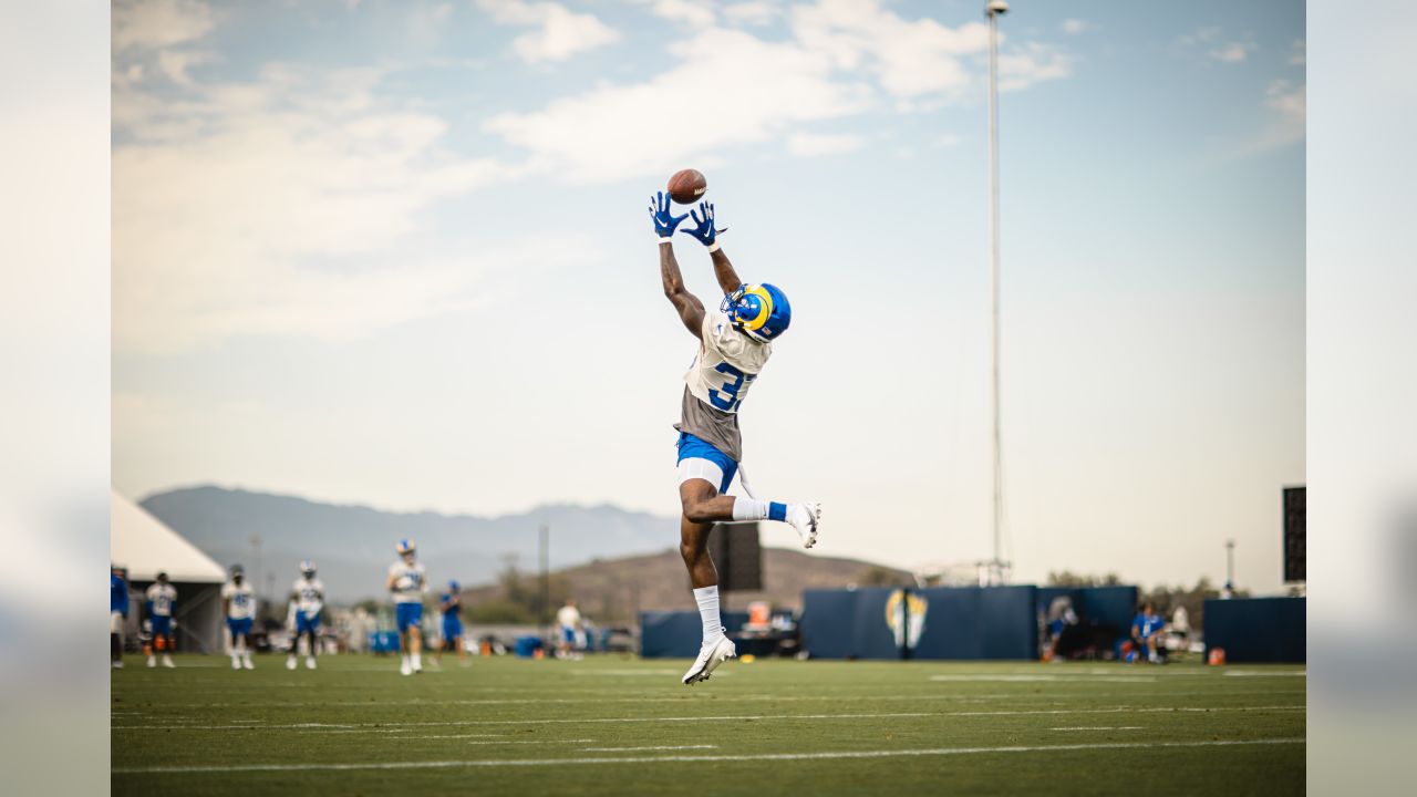
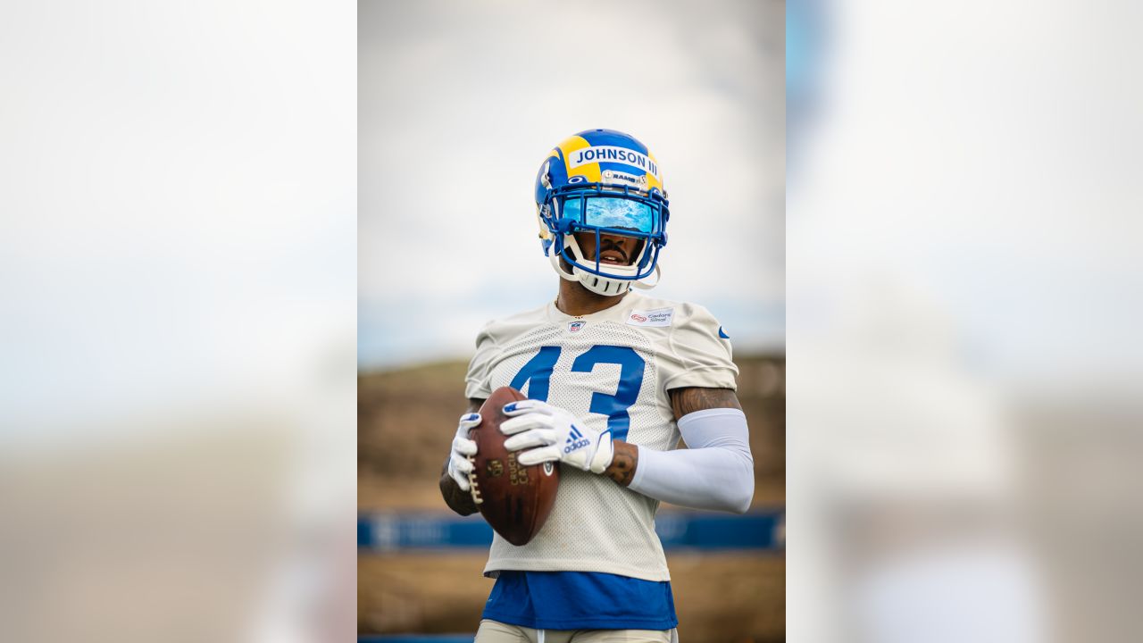
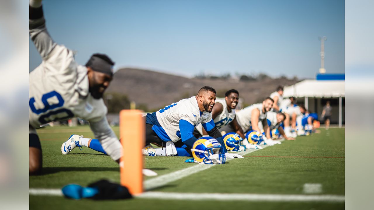
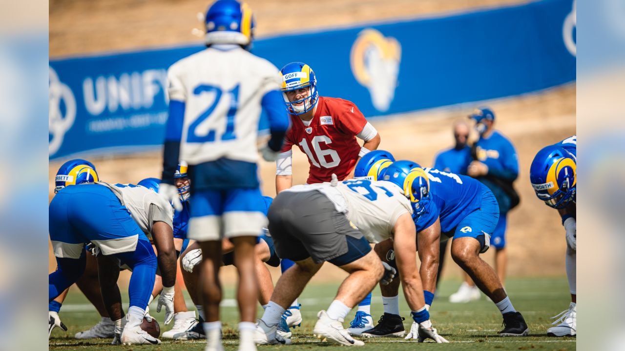
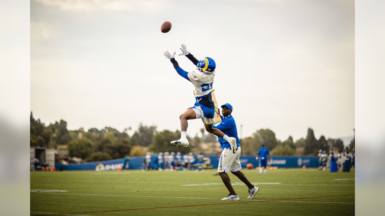
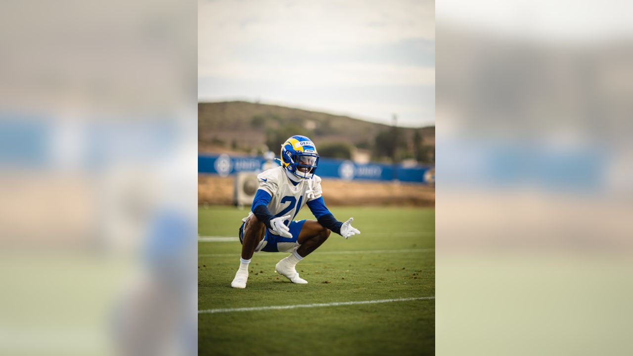
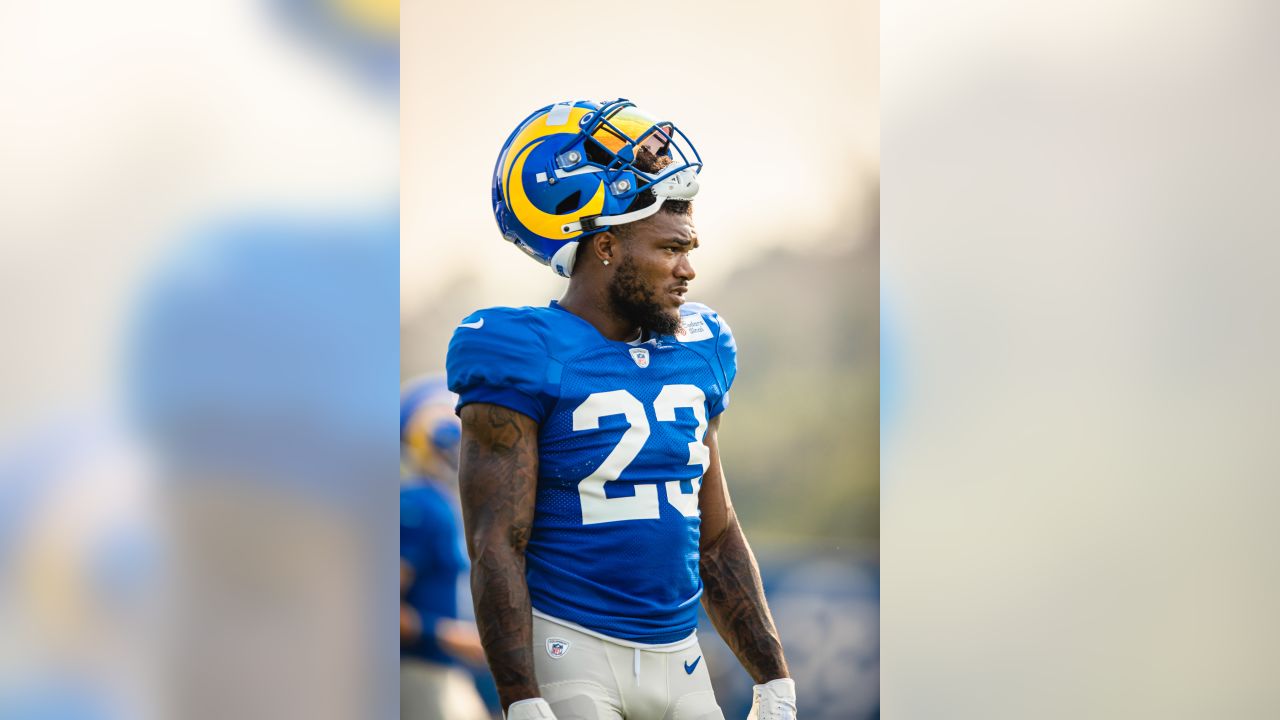
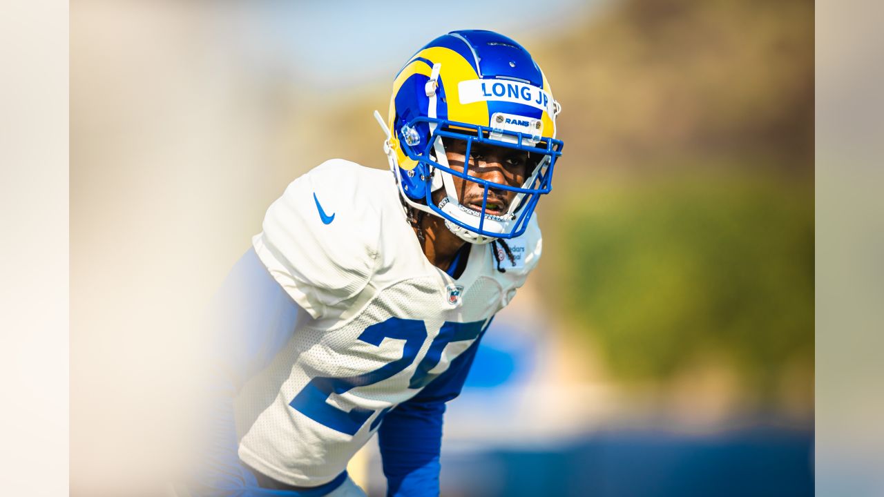
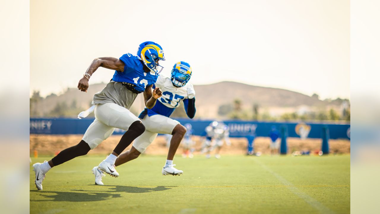
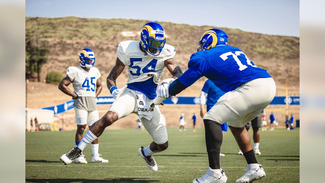
just wowIs that Dont'e Deayon in the 5th to last picture?
Is that Dont'e Deayon in the 5th to last picture?
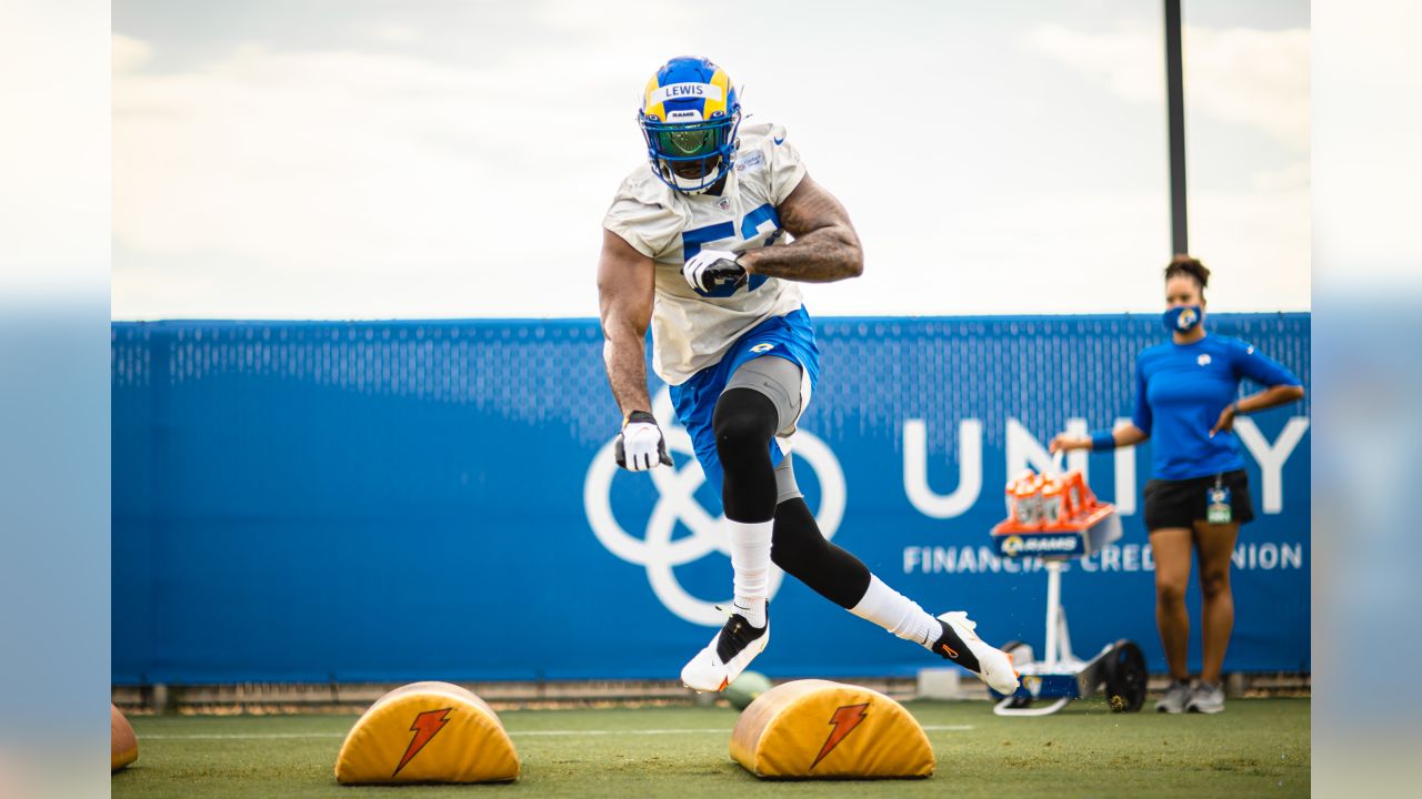
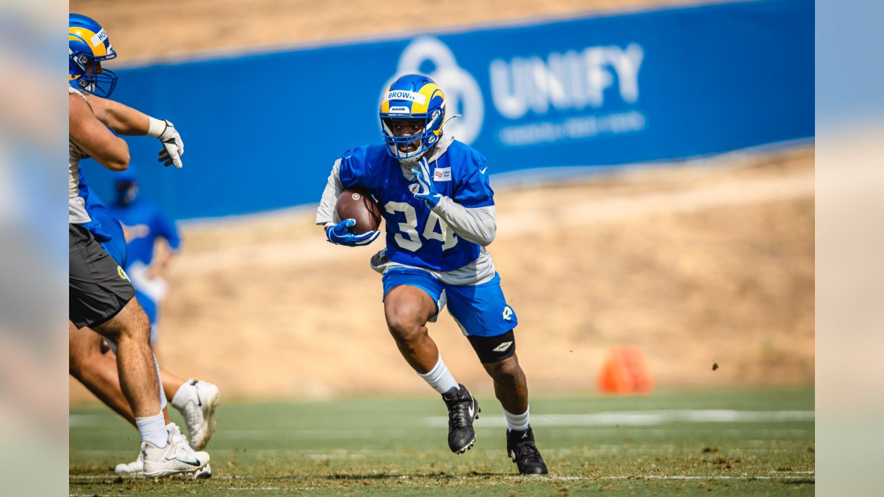
Holy Shit, he got some springs!!!
- Thread Starter Thread Starter
- #2,065
Holy Shit, he got some springs!!!
Have you seen Hard Knocks? Dude weighs like 75 lbs, and it's all muscle. I'm surprised he doesn't leave our atmosphere when he jumps!

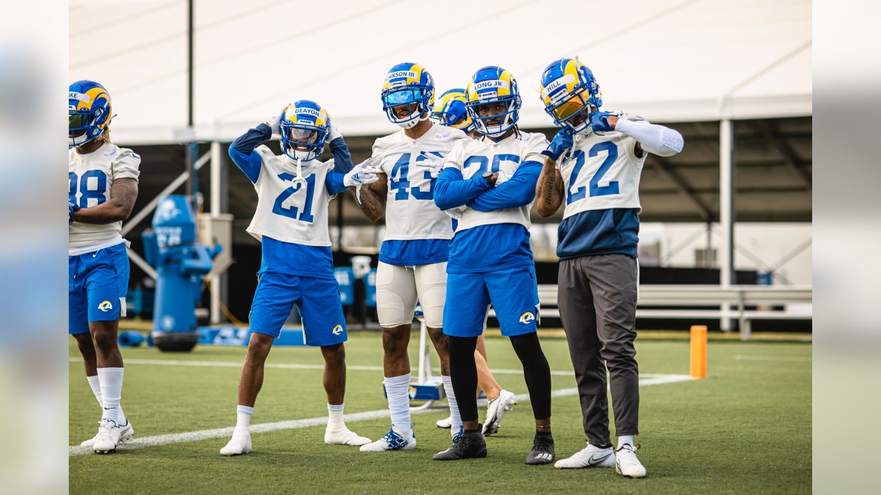
Regardless of things I could pick at, these unis are vastly better than when they "modernized" them after our Superbowl. That was a slap in the face.
I hate to say it but you're right. Regardless of what we think about the new uni's, they are vastly better than the 2000 dull blue & golds, which just look hideous in comparison. And even the new L@ logo is far better than the snail. So much energy in these unis. Let's GOOOOOORegardless of things I could pick at, these unis are vastly better than when they "modernized" them after our Superbowl. That was a slap in the face.
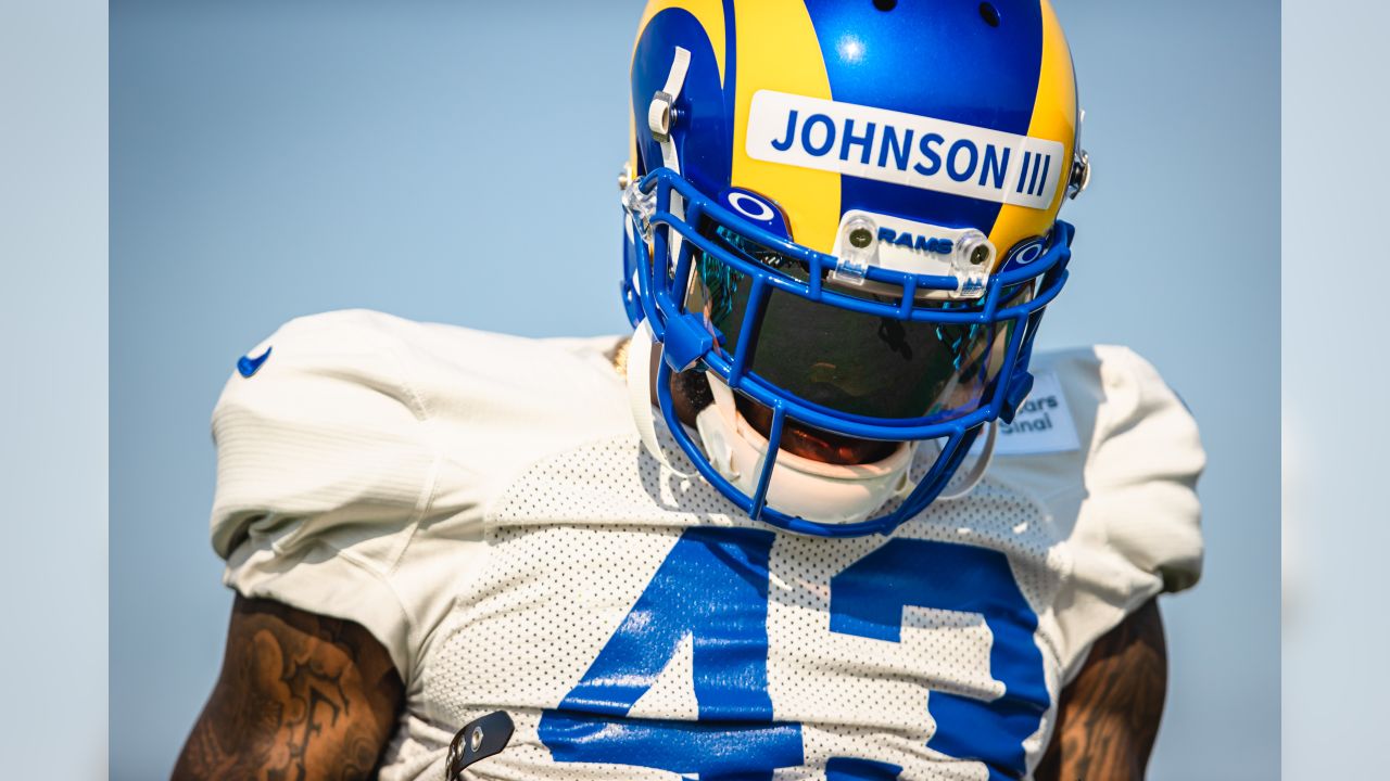
I wish the blue numbers on the bone jerseys were outlined in the yellow/"sol" and I wish the numbers on the blues were the sol color outlined in bone.... just think it would pull the concept all together better. Love the helmets and colors but the uniforms as a whole have a certain disorganized or disconnected feel to them. Im pretty sure its the numbers.
I wish the blue numbers on the bone jerseys were outlined in the yellow/"sol" and I wish the numbers on the blues were the sol color outlined in bone.... just think it would pull the concept all together better. Love the helmets and colors but the uniforms as a whole have a certain disorganized or disconnected feel to them. Im pretty sure its the numbers.
Yeah, the uniforms need more yellow on the bottom half. Balance the color.
The blue uniforms (in particular) look a lot better with yellow pants.... same the bone. At least from what I've seen. Again, it's a color balance thing.
The gradient numbers are looking like I'll never get used to those. I think that is a decision that will be reversed at some point - soon. It's just too cheesy.
I sure hope soThe gradient numbers are looking like I'll never get used to those. I think that is a decision that will be reversed at some point - soon. It's just too cheesy.
Yes, the athletes deserve to be paid nothing because you don't wike da whittle stickuhs... Get over it already.
lol.....
This right here , might be the most perfect uniform of all time

Nobody will ever convince me the grey set up or the gradient numbers are good. But you're correct.Regardless of things I could pick at, these unis are vastly better than when they "modernized" them after our Superbowl. That was a slap in the face.
This right here , might be the most perfect uniform of all time
I'm flogging a dead horse, but not even close to how good this uniform was.
Attachments
My fav for sure!I'm flogging a dead horse, but not even close to how good this uniform was.

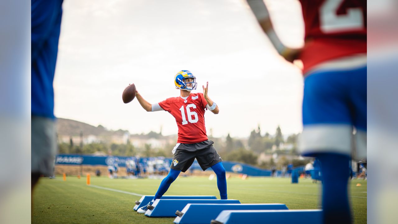
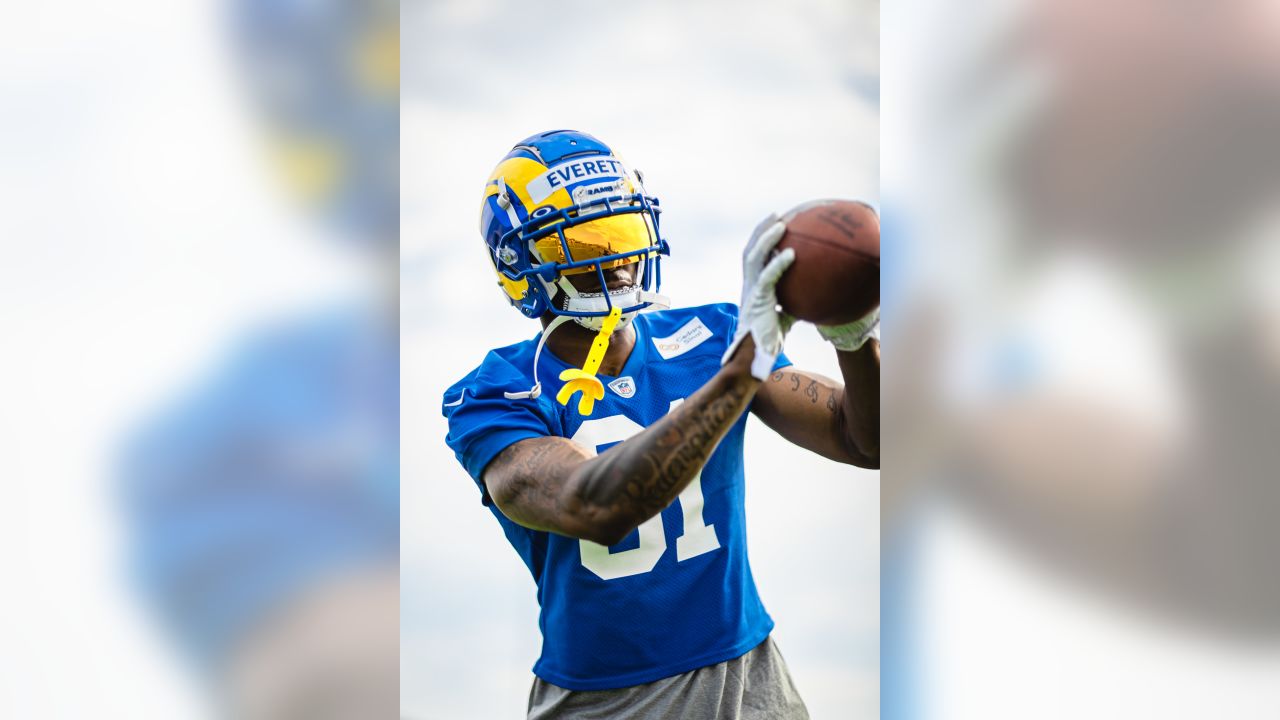
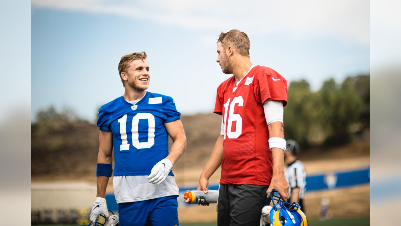
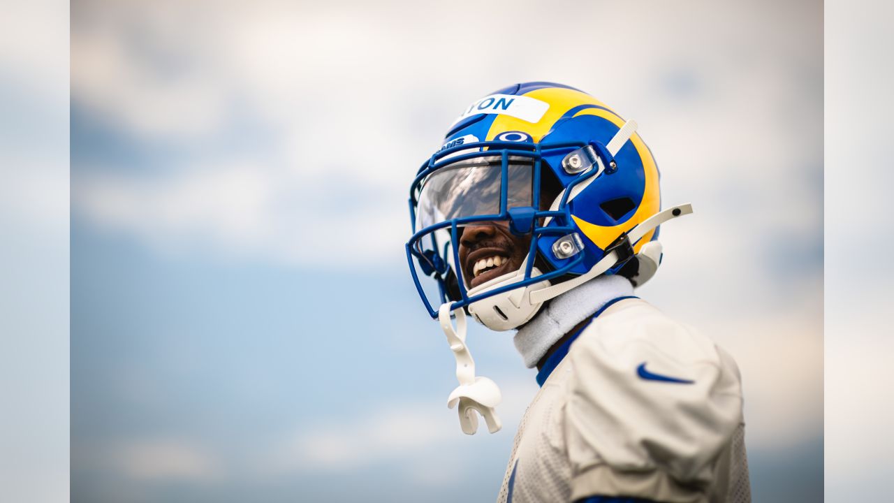
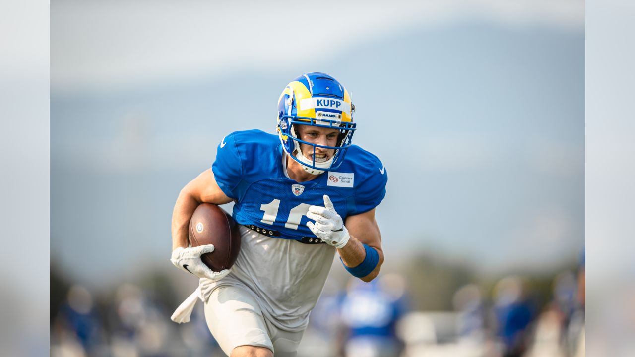
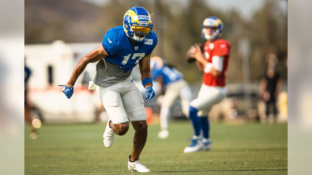
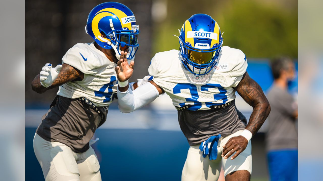
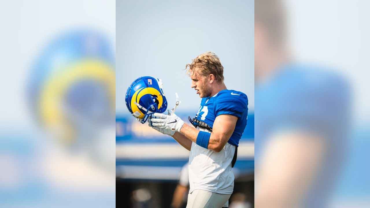
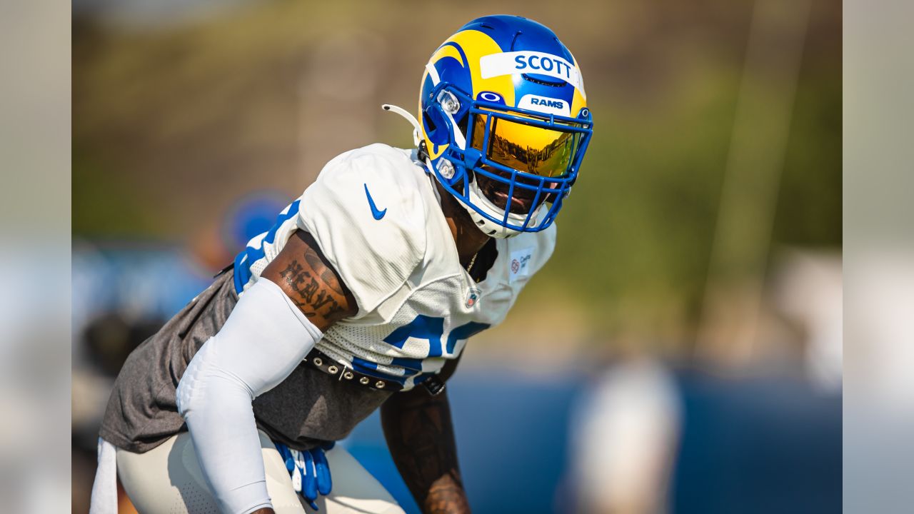
Fuck. Watching training camp today and these helmets are straight perfect. These are already my favorite kits and I haven't even seen them fully on the feild yet. I am a die hard fan of over forty years, so I doubt I was their target demo, lol.
Sucks for those of you that hate these still. Seriously, I hope you all can grow to love these unis as much as I do. It would suck to hate the way your favorite team looks on the field.
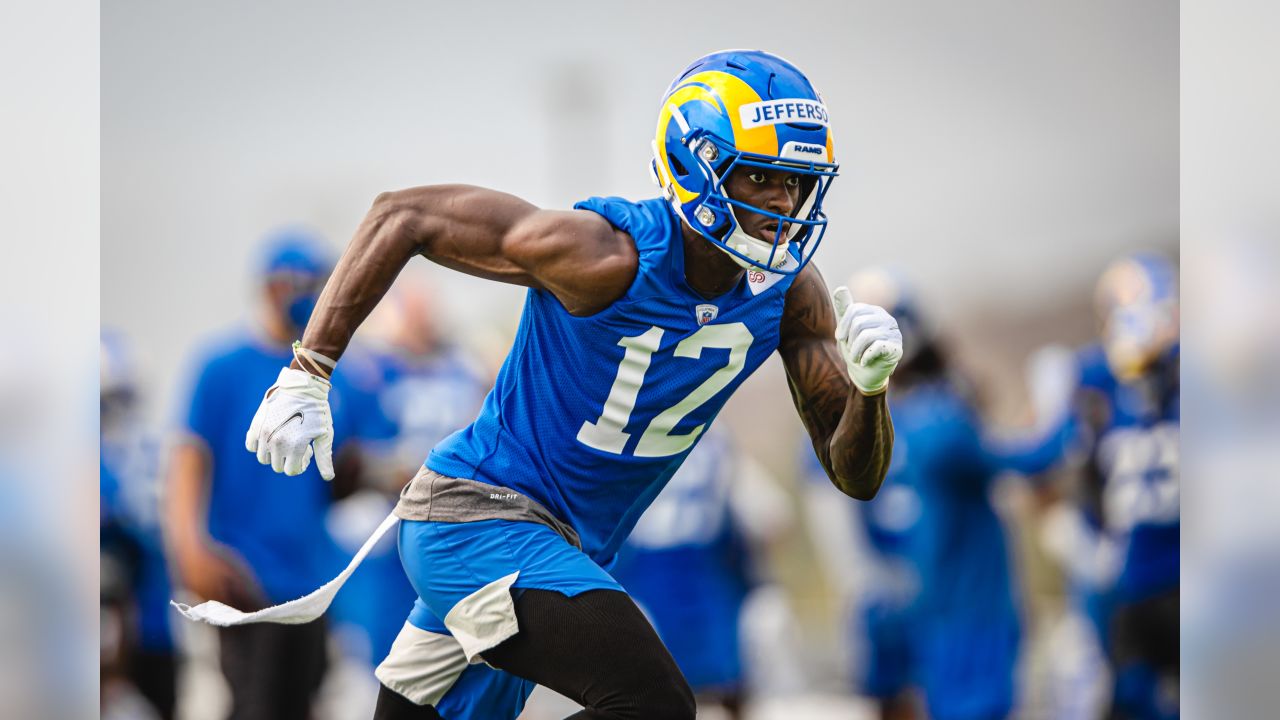
P. S Terrell Lewis looks like something you would build in Madden 2020. He's a specimen.
Sucks for those of you that hate these still. Seriously, I hope you all can grow to love these unis as much as I do. It would suck to hate the way your favorite team looks on the field.
P. S Terrell Lewis looks like something you would build in Madden 2020. He's a specimen.