simonblaze
Pro Bowler
They slow playing us...i hope the new uniform pics leak. I cant stand the "build the anticipation" rollout...especially after it went so well with the logo...
The red jersey has a gradient, hopefully the Rams stay away. Kinda doubt it though. I do like the matte finish on the helmet.
Seems like a stretch to me, I think Falcon fans are just trying to get at their rival.
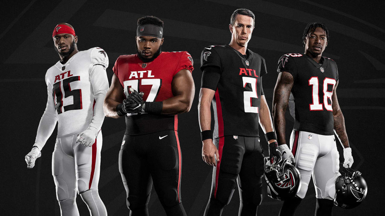
Its official. Another team embracing their city. I really like the matte helmet with the chrome facemask. The uniforms are ok. I don't like the "ATL" chest, or the numbers and I don't like the gradient jersey. The gradient makes me nervous considering our logo. The Browns are set to debut theirs next week.
View attachment 35322
Other than the ATL on the chest, these look good too. I hate unis that have blocks on the name plates or sleeves like their old ones.
The gradient is not overdone, so it's OK in my book. Looks like it's just the color rush option. The throwback with the black on white looks the best. White on red pants looks the worst.
Its official. Another team embracing their city. I really like the matte helmet with the chrome facemask. The uniforms are ok. I don't like the "ATL" chest, or the numbers and I don't like the gradient jersey. The gradient makes me nervous considering our logo. The Browns are set to debut theirs next week.
View attachment 35322
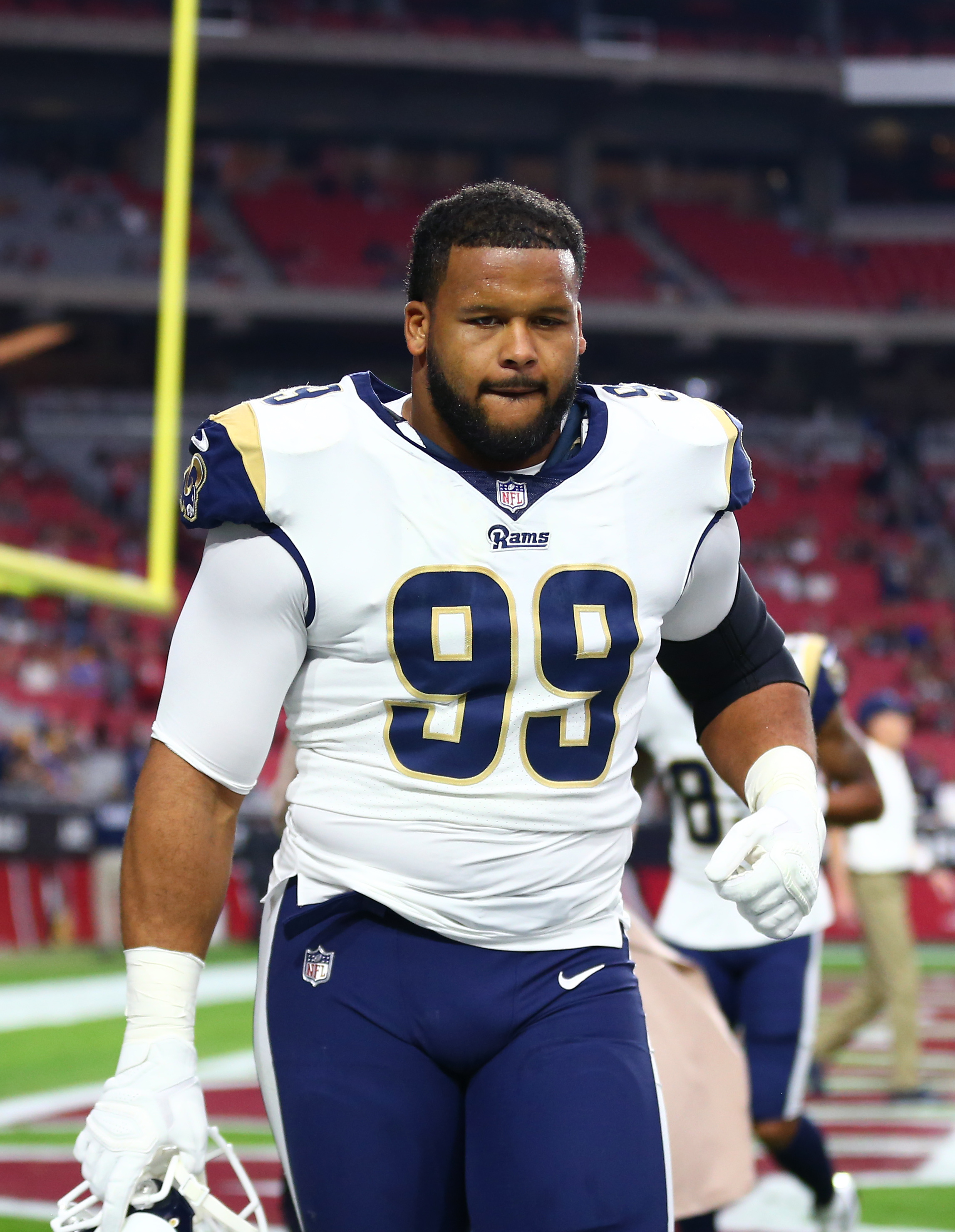
From what I've read there's only 8, only. The throwbacks and gradient are standalone. As for the Rams that depends on how far they take it. I assume we'll always have the throwback as an option, they've had mismatched helmets to uniforms before so it shouldn't stop them now. I guess as long as every uniform set isn't a gradient there will be some options.I wonder if the Rams will have 37 different versions
It sure looks like all of the new ones have the city on chest (or team name). I'm betting ours say "Los Angeles" vs "Rams" given the "Fight for LA" crap...
With that many variations , there should at least one we like........lolFrom what I've read there's only 8, only. The throwbacks and gradient are standalone. As for the Rams that depends on how far they take it. I assume we'll always have the throwback as an option, they've had mismatched helmets to uniforms before so it shouldn't stop them now. I guess as long as every uniform. set isn't a gradient there will be some options.
The league has weird rules about how often special uniforms can be used for some reason. My guess is a total of 4 including the throwback uniforms. So far it seems like every team is opting for a simpler route which is a good sign for us. But the Rams are the only team who's decided to completely change their logo so that might mean the same with the uniforms.I wonder how often they'll use the gradient? Not going to lie, the Falcons and Bucs new uniforms are pretty clean. We better not shit the bed with this one, too
Its official. Another team embracing their city. I really like the matte helmet with the chrome facemask. The uniforms are ok. I don't like the "ATL" chest, or the numbers and I don't like the gradient jersey. The gradient makes me nervous considering our logo. The Browns are set to debut theirs next week.
View attachment 35322
 www.nfl.com

