Already Ordered Mine
Don't recall seeing that type of design before, but I like it. Too bad it has the LA logo on the back or I'd get it.

Already Ordered Mine
Don't recall seeing that type of design before, but I like it. Too bad it has the LA logo on the back or I'd get it.
Fanatics... TBH I ordered it the day after they unveiled the uniforms. Just got it today. Still waiting for the Donald one for me. They originally told me it would be in August.Is that from the Rams website ?
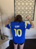
Definitely a replica but I like it. Numbers and horns have that latex feel and the highlighted outline to the numbers. Kupp name is not stitched either. For a replica... I give it a solid 8/10. 100% Polyester but lightweight. Looks sharpWhat’s your take on it?
what size is that ?Definitely a replica but I like it. Numbers and horns have that latex feel and the highlighted outline to the numbers. Kupp name is not stitched either. For a replica... I give it a solid 8/10. 100% Polyester but lightweight. Looks sharp
She got a youth Med. I'm still waiting on my Donald jersey that I ordered at the same time. Interested to see the Bone and how you like it.what size is that ?
is that a Mens ?
I ordered both a blue and bone Aaron Donald jersey
website just says it will be shipped by Sept 15th
I’m howling at the fact that they made ED sign the new helmet design after all the trash he talked about the new uniforms and logos.
but he for one reason or another, he has absolutely NO problem signing these new helmets.
Yes, blue socks make this uni pop the most!
Digging this look! Those socks give the bone set a pop. They seemed a bit bland with out it to me.
I’m howling at the fact that they made ED sign the new helmet design after all the trash he talked about the new uniforms and logos.
By far my hardest pill to swallow for the uni’s is that ugly ass gradient. I can deal with everything else. The white outline makes it pop. Hell just yellow it would be better.I sure does look fresh and pops in that image! Very nice. Wooo!
Here is a mocked up a version with white outline on the numbers, instead of gradient. I would have prefer white added in solids, myself.
I will say, this Woods image is the best looking on field rendering I’ve seen. Excited!
View attachment 37321