Looking at 2020 uniforms

  • To unlock all of features of Rams On Demand please take a brief moment to register. Registering is not only quick and easy, it also allows you access to additional features such as live chat, private messaging, and a host of other apps exclusive to Rams On Demand.

RamsFanCK

HAIL ME
Joined
Jun 11, 2013
Messages
6,036
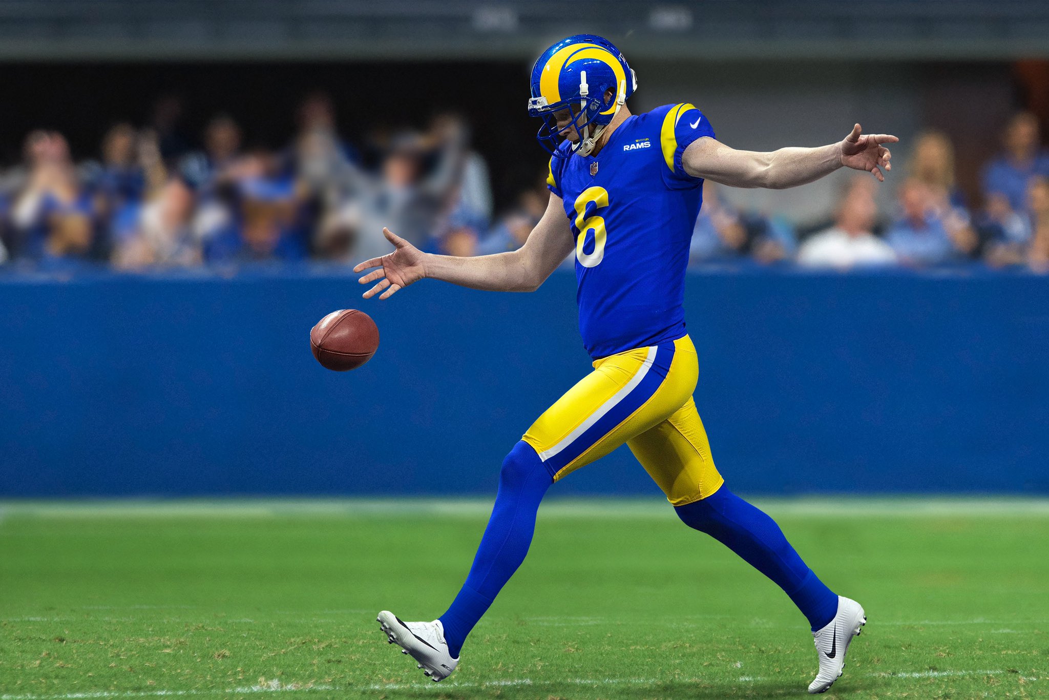
Best part is they didn’t go to crazy and kept it very simple, am I a huge fan, nah, do I hate them, nah.
I do like the way the yellow pops on the bone jersey though
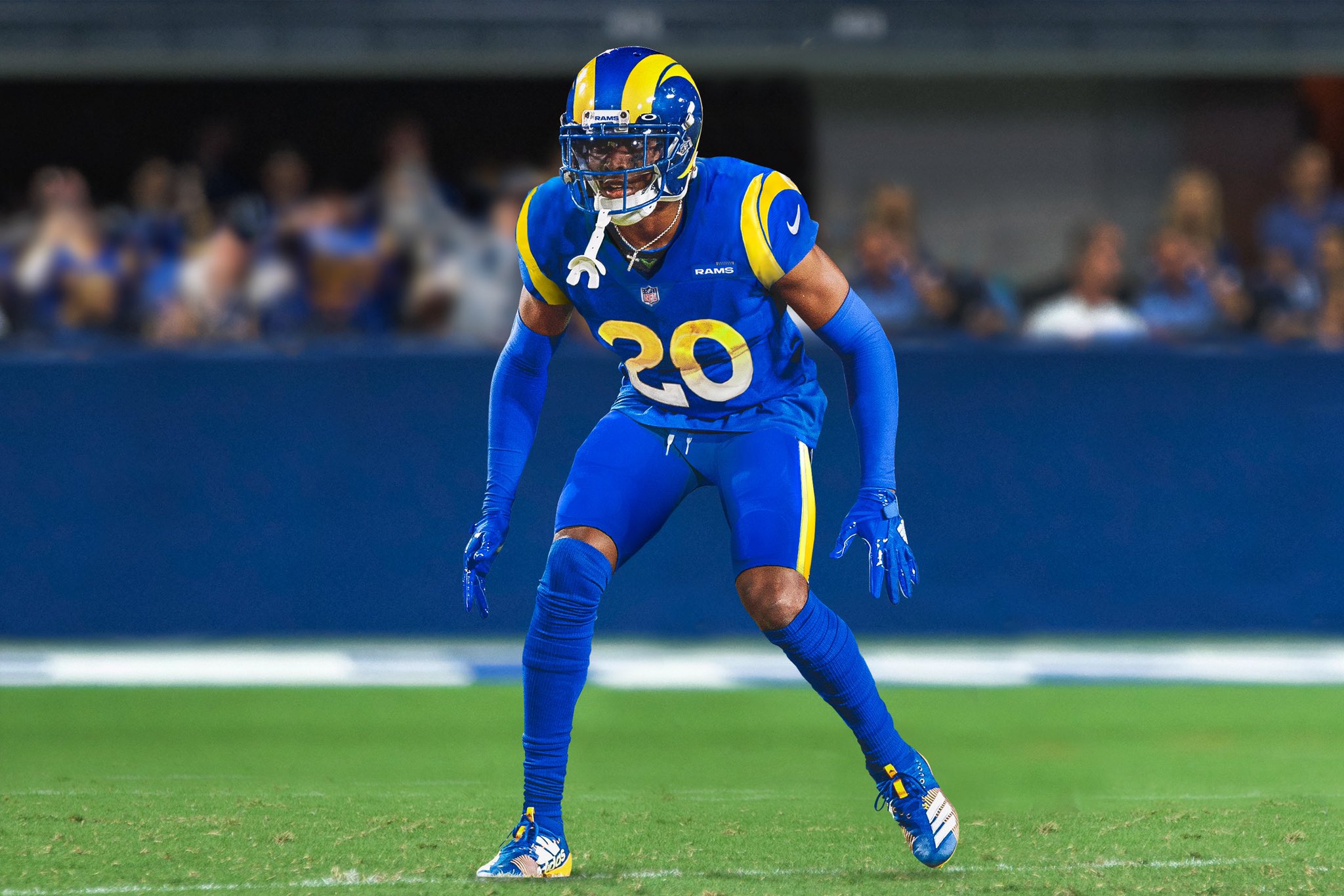
 

Ewe83

Mama's got a new baby boy
Joined
Oct 10, 2018
Messages
1,126
Well I'll be in the minority but these are nice, I'm happy, also glad we finally got to see them, don't know what took so long
 

RamsFanCK

HAIL ME
Joined
Jun 11, 2013
Messages
6,036
02E04342-40B6-448B-988C-81D3F6883A33.jpeg
D1078038-C269-45D0-87AD-3730DD082CB8.jpeg
 

Ewe83

Mama's got a new baby boy
Joined
Oct 10, 2018
Messages
1,126
I'm really loving that bone jersey I'll need a Goff one, could do without the gradient on the home jersey but I'll live
 

OregonRamsFan

All Horned Up
Rams On Demand Sponsor
Joined
Apr 23, 2016
Messages
1,996
I hope they will grow on me. They look a bit too unsophisticated for my tastes. Not real sure about the numbers’ font and gradient. I’m hoping I will learn to like them.

Edit: the numbers look too kind and happy. Much like our Rams head. We are now a kinder, gentler Rams team. Lol.
 

SWAdude

And don't call me Shirley
Rams On Demand Sponsor
Joined
May 23, 2018
Messages
2,403
Name
John
With a few required tweaks us Ferragamo guys got out our royal and gold back.

And yeah, I like the bone on the road too.

I like like them. Not too busy.
 

thirteen28

I like pizza.
Rams On Demand Sponsor
Joined
Jan 15, 2013
Messages
8,486
Name
Erik
Likes:

- I actually like the break in the horn. It still pays respect to the past but gives the horn a modern flair
- The bone white looks good
- I like the numbers. The gradient color change looks better than I thought it would

Dislikes:

- I'm never going to be crazy about the blue on blue look. Didn't like the old blueberries, won't like this one
- think the bone pants should either have no stripe or a combo blue/yellow. The yellow in isolation is too hard to see.

Other thoughts - still hoping the thowbacks are the blue/white. I've really dug the blue/white combo of the last few years and had hoped against hope that the new unis would be a modernized version of that. I'll settle with those being the throwbacks, and think it would be a better choice since the unis we got are more or less a modernized version of the blue/yellow.
 

LARams_1963

Rams On Demand Sponsor
Joined
Jun 29, 2016
Messages
2,828
Name
greg
I'm OK with the home. The away is lacking on the sleeves also what's the need for the "Los Angeles Rams" patch on the left chest?? .The LOGO on the back of the neck really annoys the fuck outta me....


Screenshot (29).png
 

Dodgersrf

Moderator
Moderator
Joined
Mar 17, 2014
Messages
11,130
Name
Scott
I'll reserve my thoughts on them until i see them on the field.
Exactly.
Its simple. Which is good. They didn't try to fit a bunch of small details that would never even be seen on the field.
The uni as a whole, may look good on the field.

IDK. I'm just hoping I end up liking them.
At least we're not Broncos fans.
 

LARams_1963

Rams On Demand Sponsor
Joined
Jun 29, 2016
Messages
2,828
Name
greg
I'm OK with the homes. I actually think the blue on blues are pretty sharp. Only HUGE thing that I'm not a fan of is the Logo on the neck of the away, and the Los Angeles Rams patch on the front left of the away.

Screenshot (29).png