Looking at 2020 uniforms
- Thread starter GoodBadUgly
- Start date
-
To unlock all of features of Rams On Demand please take a brief moment to register. Registering is not only quick and easy, it also allows you access to additional features such as live chat, private messaging, and a host of other apps exclusive to Rams On Demand.
You are using an out of date browser. It may not display this or other websites correctly.
You should upgrade or use an alternative browser.
You should upgrade or use an alternative browser.
Boston Ram
Hall of Fame
I dont understand....we had great classic uniforms. It was going to be hard to ruin a great uniform, looks like they succeeded. 
- Thread Starter Thread Starter
- #1,384
Some things they got right. Some not so much.
Biggest win for me are the colors. Traditional royal/yellow made it through while introducing modern wrinkle in bone. After all, Dodgers wear this on the road all the time.
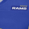
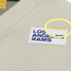
Biggest loss is the tag on the front of the shoulder. Looks like a price tag/label, hoping that is not permanent but feeling like I won't get my way on this. Just silly.
I HATED the break in the horns and the gradient at first, but I now file this in the "I'll get used to it" folder.
Ok so... following the logo release I was expecting the worst but these are not bad!
Billy Baroo
How about a Fresca?
The dual-colored numbers on homes will be dated in about 2 mins. Otherwise I like them! Feared for much worse.
bluecoconuts
Legend
Had a thought, those Bone color jerseys are gonna look fire with a little mud and dirt on them under the lights.
I’m thinking these are gonna look good on the field in motion.
I’m thinking these are gonna look good on the field in motion.
I like em. The segmented numbers look strange to me and i would've preferred it if the away didn't have yellow on it. I can live with it as I'm sure those things will eventually grow on me. The gradient looks ok. Not great but not terrible. Their definitely better than most of the other new unis that have been revealed lately imo.
I love that the uni blue matches the helmet blue
I like Rams
Hall of Fame
Oh great, we're fucking Power Rangers.
I'm glad the players are feeling the jerseys. As for the fans those who don't love them, they will grow on you.
I'll reserve my thoughts on them until i see them on the field.
I was thinking the same thing.
Showing what they are selling and how they wear it on game day is always a huge difference.
I could get all picky on these but basically I love them.
They are unique to the present day Los Angeles Rams.
I like them more in HD. The bone looks better, brighter.
I don't like that they messed with the helmet horn, but that being said I love these new uniforms!! thank you thank you thank you for not putting that stupid new logo on it!! I'm super happy with new uniforms, now I wish they would change that logo!!
To anyone that doesn't like these, let me remind you of this

The worst to me is opposing fans. A lot of them are saying the same thing, we had the best uniforms and we abandoned them for this crap.
Chargers: "Our threads are so dope best in the leagues OMGZ"
Rams: "You're still our bitch".
Rams: "You're still our bitch".
Just a head up, the stripe is gradient too (look at the eleventh slide)
PHOTOS: Full details of the new uniform
www.therams.com


