Another Uniform Thread - 2021 Uniforms Revealed
- Thread starter CGI_Ram
- Start date
-
To unlock all of features of Rams On Demand please take a brief moment to register. Registering is not only quick and easy, it also allows you access to additional features such as live chat, private messaging, and a host of other apps exclusive to Rams On Demand.
You are using an out of date browser. It may not display this or other websites correctly.
You should upgrade or use an alternative browser.
You should upgrade or use an alternative browser.
Blue and White, dammit!!
Let's pay some homage to the Fearsome Foursome, Gabriel, et. al.
RamsOfCastamere
I drink things, and know nothing
I have to say, the sleeves of the blue and the new alternates looks good with pads on due to the smaller shoulder pads, but as fan jerseys the longer sleeves look plain. I like a number or a logo on the sleeves to fill that empty space. That's one thing I like about the bone jerseys.
RamsOfCastamere
I drink things, and know nothing
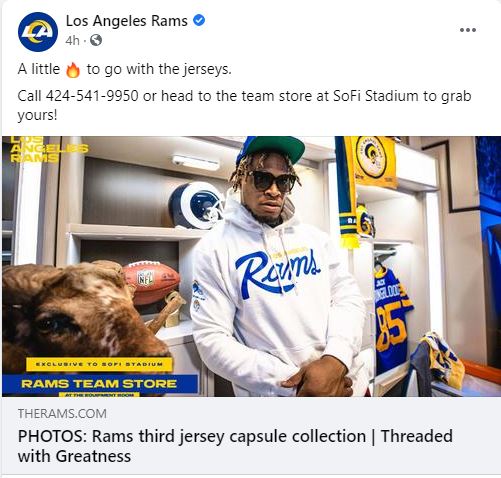
Nope, that's all that's online unless you go to a team store in LA. The store at Sofi has them but I'm not sure about other stores locally.I'm only seeing Kupp, AD and Stafford available right now - anyone see more somewhere?
Sounds like you can call the team store at SoFi, if you're looking for a specific players jersey
Call 424-541-9950
Call 424-541-9950
Yeah I've seen them, they look awesome, and they really piss me off.
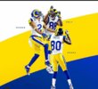
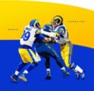
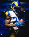
These pics imply that the new unis look extremely similar to the old ones.... but they DON'T.
I swear, it feels like the Rams PR department is trying to "gaslight" us longtime fans into thinking they are "continuing the tradition" by keeping the same colors of the old uniforms. If the new unis ACTUALLY looked this similar to the old ones, I for one would be ecstatic.
But they don't. They did a complete overhaul-- new logos, new uniforms, new colors... everything is different.
So why gaslight us and pretend they are "honoring tradition"?
Complete BS in my opinion.
For people who like the new unis, great, good for you. But the Rams should "own it" and be honest about creating something brand new. Why falsely pretend that the colors of the new unis look the same as the old ones?
Talk about false advertising!
nighttrain
Legend
two uniforms, the '60's all white and and the home uniforms of Jack Yougblood-Kurt Warner Rams
train
train
C'mon now, don't go full TuTu! Stan just wants everyone to purchase extra uniform jerseys every year, so get that visa card out and do your duty!Yeah I've seen them, they look awesome, and they really piss me off.
These pics imply that the new unis look extremely similar to the old ones.... but they DON'T.
I swear, it feels like the Rams PR department is trying to "gaslight" us longtime fans into thinking they are "continuing the tradition" by keeping the same colors of the old uniforms. If the new unis ACTUALLY looked this similar to the old ones, I for one would be ecstatic.
But they don't. They did a complete overhaul-- new logos, new uniforms, new colors... everything is different.
So why gaslight us and pretend they are "honoring tradition"?
Complete BS in my opinion.
For people who like the new unis, great, good for you. But the Rams should "own it" and be honest about creating something brand new. Why falsely pretend that the colors of the new unis look the same as the old ones?
Talk about false advertising!
They look awfully similar. I don't see much misrepresentation from the PR. I think that they are showing what inspired their uniform choice, not to trick anyone.Yeah I've seen them, they look awesome, and they really piss me off.
These pics imply that the new unis look extremely similar to the old ones.... but they DON'T.
I swear, it feels like the Rams PR department is trying to "gaslight" us longtime fans into thinking they are "continuing the tradition" by keeping the same colors of the old uniforms. If the new unis ACTUALLY looked this similar to the old ones, I for one would be ecstatic.
But they don't. They did a complete overhaul-- new logos, new uniforms, new colors... everything is different.
So why gaslight us and pretend they are "honoring tradition"?
Complete BS in my opinion.
For people who like the new unis, great, good for you. But the Rams should "own it" and be honest about creating something brand new. Why falsely pretend that the colors of the new unis look the same as the old ones?
Talk about false advertising!
nighttrain
Legend
so why not go with the Dickerson jersy? Lot of history there
train
train
In your photo above, the blues look obviously different. Left is Navy blue, the right is more sky blue. Not so in the PR photos, they look almost identical.They look awfully similar. I don't see much misrepresentation from the PR. I think that they are showing what inspired their uniform choice, not to trick anyone.
View attachment 46531
As for the yellow, one really notices the difference in a large section of color-- as with the pants. (Old color was gold, new color is highlighter yellow) But just on the shoulder of the jersey sleeve, yeah, it's hard to tell.
Whenever I saw the Rams on the field in 2020, it was pretty obvious that their colors were different from years prior. But those PR photos imply they are almost identical.
When the Rams returned to LA, I was ecstatic that they revived the traditional colors. It was so great to leave behind that dingy brown/beige color from the St Louis days.
But now they've messed with the colors yet again.
What can I say, it just bums me out that I can't see my traditional team colors on Sundays anymore. IMHO it's disrespectful to long-time fans for the PR department to "pretend" they haven't changed the color scheme.
They even emphisized the split horn on the sleeves of the new white uni. I guess that means we'll never see the true rams horn on the helmets again.
In your face Oldtimers.
In your face Oldtimers.

I can definitely agree with you about the pants, though the recent photo with Kupp they do look darker and with our new unis the color does change depending on the lighting, but as for the rest of the jersey you can still see a difference. No one is "pretending" that they're identical. The helmet destroys that illusion right away. Look at the shine on the blue of our new ones and how the old ones are flat by comparison. Our new colors are very similar to those classics, yes they're different but not drastically.In your photo above, the blues look obviously different. Left is Navy blue, the right is more sky blue. Not so in the PR photos, they look almost identical.
As for the yellow, one really notices the difference in a large section of color-- as with the pants. (Old color was gold, new color is highlighter yellow) But just on the shoulder of the jersey sleeve, yeah, it's hard to tell.
Whenever I saw the Rams on the field in 2020, it was pretty obvious that their colors were different from years prior. But those PR photos imply they are almost identical.
When the Rams returned to LA, I was ecstatic that they revived the traditional colors. It was so great to leave behind that dingy brown/beige color from the St Louis days.
But now they've messed with the colors yet again.
What can I say, it just bums me out that I can't see my traditional team colors on Sundays anymore. IMHO it's disrespectful to long-time fans for the PR department to "pretend" they haven't changed the color scheme.
I get it, you and the rest of the older fans were expecting a return to the classic colors and style. I think that they tried to do that but put some new elements in there too for the next wave of fans to associate with. I was too young for the classic era so while I love the look and color I can't truly relate to it. I honestly don't think that they're trying to trick anyone with these promos.
The actual team colors are very similar, and close to navy. Not seeing the sky you're referring to though.
sky navy new blue old blue
Last edited:
Yeah, when I look at those photos I can see that the blues are definitely different. They even make sure to put some light reflection of those dopey number outlines on the new uniform.I can definitely agree with you about the pants, though the recent photo with Kupp they do look darker and with our new unis the color does change depending on the lighting, but as for the rest of the jersey you can still see a difference. No one is "pretending" that they're identical. The helmet destroys that illusion right away. Look at the shine on the blue of our new ones and how the old ones are flat by comparison. Our new colors are very similar to those classics, yes they're different but not drastically.
I get it, you and the rest of the older fans were expecting a return to the classic colors and style. I think that they tried to do that but put some new elements in there too for the next wave of fans to associate with. I was too young for the classic era so while I love the look and color I can't truly relate to it. I honestly don't think that they're trying to trick anyone with these promos.
The actual team colors are very similar, and close to navy. Not seeing the sky you're referring to though.
sky navy new blue old blue
However, I am offended that they think we're gullible enough to believe that Donald and Youngblood played together!
Yeah you're right about it not being "sky".I can definitely agree with you about the pants, though the recent photo with Kupp they do look darker and with our new unis the color does change depending on the lighting, but as for the rest of the jersey you can still see a difference. No one is "pretending" that they're identical. The helmet destroys that illusion right away. Look at the shine on the blue of our new ones and how the old ones are flat by comparison. Our new colors are very similar to those classics, yes they're different but not drastically.
I get it, you and the rest of the older fans were expecting a return to the classic colors and style. I think that they tried to do that but put some new elements in there too for the next wave of fans to associate with. I was too young for the classic era so while I love the look and color I can't truly relate to it. I honestly don't think that they're trying to trick anyone with these promos.
The actual team colors are very similar, and close to navy. Not seeing the sky you're referring to though.
sky navy new blue old blue
As for the issue of whether the PR campaign is intentionally deceiving, we can just agree to disagree.
Yes, of course the helmet colors are different.
But on all the jersey pics above, the jersey colors look virtually identical. Donald colors look just like Youngblood colors. Stafford colors look just like Warner colors. And Woods colors look just like Ike and Torry.
IMHO the PR department produced those altered pics in order to try to appease some of us older fans. And they enlisted the help of ED, Youngblood, Ike, and so on, for the same reason. It was an attempt to say, "see we're keeping faith with the old traditions."
We can stop debating I guess. To me, it seems demonstrably true that:
--on the PR pics, the jersey colors look virtually identical.
--when you see the actual New Jerseys next to the actual old ones, it's quite obvious the colors are different.
For anyone who thinks the PR pics are an accurate rendering of the similarities of color, I don't know what else to say.
I don't know what to tell you, there's definitely a difference. You obviously feel a certain way about it. They look very similar because they are. The blue on the new ones are obviously lighter, look at the numbers. Same with the real jerseys. I used the hexcode for the fonts and the blues are awfully close. If you feel like you're being deceived, sorry dude that sucks for you.Yeah you're right about it not being "sky".
As for the issue of whether the PR campaign is intentionally deceiving, we can just agree to disagree.
Yes, of course the helmet colors are different.
But on all the jersey pics above, the jersey colors look virtually identical. Donald colors look just like Youngblood colors. Stafford colors look just like Warner colors. And Woods colors look just like Ike and Torry.
IMHO the PR department produced those altered pics in order to try to appease some of us older fans. And they enlisted the help of ED, Youngblood, Ike, and so on, for the same reason. It was an attempt to say, "see we're keeping faith with the old traditions."
We can stop debating I guess. To me, it seems demonstrably true that:
--on the PR pics, the jersey colors look virtually identical.
--when you see the actual New Jerseys next to the actual old ones, it's quite obvious the colors are different.
For anyone who thinks the PR pics are an accurate rendering of the similarities of color, I don't know what else to say.
Yeah it's kinda hard to track your argument because you say "there's definitely a difference" and then a sentence later you say "they look very similar because they are."I don't know what to tell you, there's definitely a difference. You obviously feel a certain way about it. They look very similar because they are. The blue on the new ones are obviously lighter, look at the numbers. Same with the real jerseys. I used the hexcode for the fonts and the blues are awfully close. If you feel like you're being deceived, sorry dude that sucks for you.
And as for your last sentence, knock off the condescending bullshit.

