- Thread Starter Thread Starter
- #381
Another Uniform Thread - 2021 Uniforms Revealed
- Thread starter CGI_Ram
- Start date
-
To unlock all of features of Rams On Demand please take a brief moment to register. Registering is not only quick and easy, it also allows you access to additional features such as live chat, private messaging, and a host of other apps exclusive to Rams On Demand.
You are using an out of date browser. It may not display this or other websites correctly.
You should upgrade or use an alternative browser.
You should upgrade or use an alternative browser.
- Thread Starter Thread Starter
- #382
- Thread Starter Thread Starter
- #383
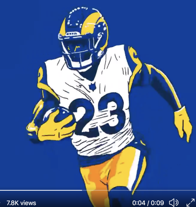
First off, I dig the new white alternates. It's obviously a slight, new twist on the classic design which is fine in my book. This is what they should have done from the start in my humble opinion. And the twitter short movie CGI_Ram posted is badass.
But as XXXIVwin points out, the whole ad campaign is deceptive. The front office made a conscious decision to chose new colors. So own it Demoff! Or change the colors if you want to attract a different element of the fan base. Don't lie about it.


Man, I wish they would have went with the more golden yellow in the doctored, first pic above. However, judging from this current ad campaign, I think Demoff and the front office are starting to think so too.
But as XXXIVwin points out, the whole ad campaign is deceptive. The front office made a conscious decision to chose new colors. So own it Demoff! Or change the colors if you want to attract a different element of the fan base. Don't lie about it.
Man, I wish they would have went with the more golden yellow in the doctored, first pic above. However, judging from this current ad campaign, I think Demoff and the front office are starting to think so too.
Here's photos from the uniform release last yearFirst off, I dig the new white alternates. It's obviously a slight, new twist on the classic design which is fine in my book. This is what they should have done from the start in my humble opinion. And the twitter short movie CGI_Ram posted is badass.
But as XXXIVwin points out, the whole ad campaign is deceptive. The front office made a conscious decision to chose new colors. So own it Demoff! Or change the colors if you want to attract a different element of the fan base. Don't lie about it.
View attachment 46586
View attachment 46587
Man, I wish they would have went with the more golden yellow in the doctored, first pic above. However, judging from this current ad campaign, I think Demoff and the front office are starting to think so too.
New Colors. Looks "golden"
Pants under different lighting
It might be a dye issue, the cowboys had a similar issue with their "green" pants
Glad to know some other folks are noticing the same things.First off, I dig the new white alternates. It's obviously a slight, new twist on the classic design which is fine in my book. This is what they should have done from the start in my humble opinion. And the twitter short movie CGI_Ram posted is badass.
But as XXXIVwin points out, the whole ad campaign is deceptive. The front office made a conscious decision to chose new colors. So own it Demoff! Or change the colors if you want to attract a different element of the fan base. Don't lie about it.
View attachment 46586
View attachment 46587
Man, I wish they would have went with the more golden yellow in the doctored, first pic above. However, judging from this current ad campaign, I think Demoff and the front office are starting to think so too.
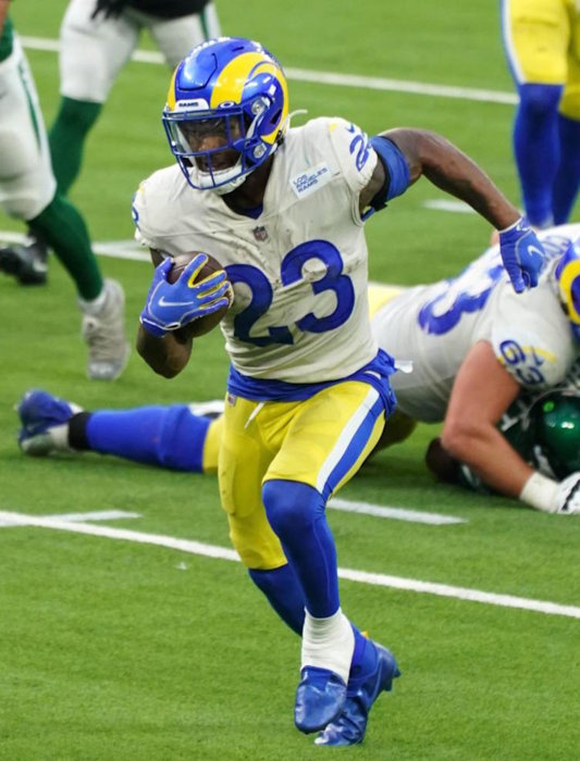
Promo pics of the unis look great-- dark blue and a golden yellow. But then when we see the real deal on Sunday, the colors look lighter.
Sometimes it seems like NFL team colors can change subtly over the years. Here's hoping that Demoff and the PR guys go with their own promos and darken the colors just a little bit...
I googled "Cowboys green pants", and yeah, it's definitely a thing! Apparently on older TV's the greenish tint made it appear as if silver was "popping" more, but with the advent of HD TV's, they just looked... green. Recently, looks like the Cowboys have gone to a truer silver instead of the sea foam green. Below, an article with pics showing the clear differences.

 nflfootballjournal.blogspot.com
Anyway... if the iconic Cowboys can make subtle changes, maybe the Rams can too. Hey Demoff, get away from that pale "highlighter yellow" and give us the real, rich yellow that looks so awesome in the promo pics! I'm with @Bootleg... unis that actually looked like the promo graphics would be awesome:


Cowboys Wore Usual Pants Sunday Night.
UNIFORMS By John Turney When we saw the Cowboys play Sunday night it looked to me like their pants were silver, not the seafoam green th...
Anyway... if the iconic Cowboys can make subtle changes, maybe the Rams can too. Hey Demoff, get away from that pale "highlighter yellow" and give us the real, rich yellow that looks so awesome in the promo pics! I'm with @Bootleg... unis that actually looked like the promo graphics would be awesome:
Last edited:
