Yeah, I say just make the Ram meaner...
That would work. I don't dislike the simple design but the Ram does need just a little more to it.
Yeah, I say just make the Ram meaner...

Quite like this one that has popped up:
I know many folks talked about the coincidence of the shape, but I never heard anyone from the organization say it was planned that way. We always new from day 1 in LA we were getting a new logo.View attachment 34902
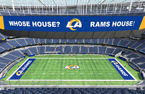
So wasn't the 5 billion dollar stadium supposed to be shaped like the Rams old logo?
Must have slipped Demoff's mind. Oooopps.....
Day 3 and the new logos still suck. They will be worse than a bad longterm contract or a middle school offense, because they will always suck.The new logos are quite bad, they are just really soulless. I have heard from Allbright, someone posted a link in r/LosAngelesRams that the new uniforms are going to be just as/ or worse than the new logos.
 news.sportslogos.net