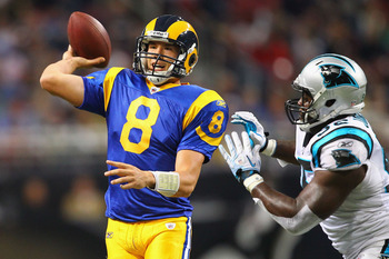
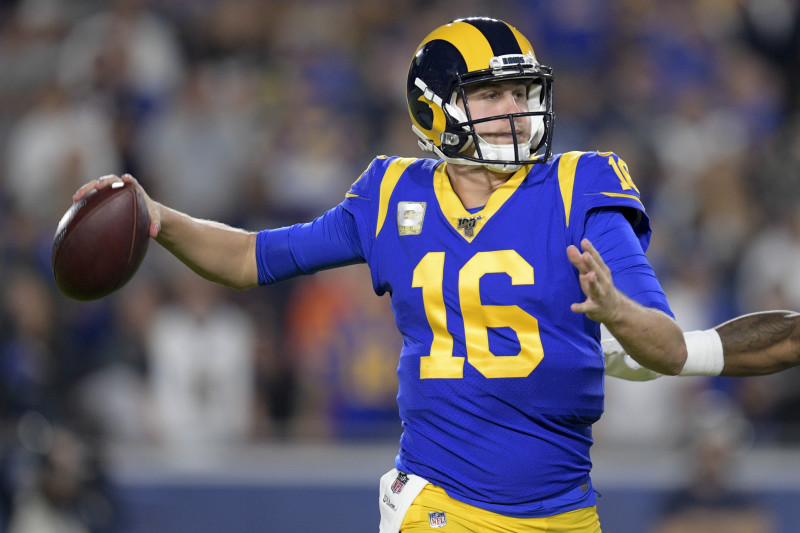
The Rebrand, One Year Later

  • To unlock all of features of Rams On Demand please take a brief moment to register. Registering is not only quick and easy, it also allows you access to additional features such as live chat, private messaging, and a host of other apps exclusive to Rams On Demand.

OYL, yes or no on the Rebrand?


  • Total voters
    67

PhillyRam

Rams On Demand Sponsor
Joined
Jun 1, 2013
Messages
7,409
Name
Scott
Like the colors, they screwed up the helmet a bit in my view.

And kill the bone and go with the week 1 style from this yr.
 

Tron

Fights for the User
Joined
Jun 1, 2013
Messages
7,847
Name
Tron
Colors are good(except bone, looks like dirty underwear, shoulda gone white or Grey) , yellow could be a shade darker so doesn't look so much like a highlighter. Have gotten a bit used to the helmet horns so don't completely hate them anymore, still prefer the old. Everything else sucks imo. Hate the rebrand.
 

XXXIVwin

Legend
Joined
Jun 1, 2015
Messages
5,051
I think it’s a difference of playing in the sun last year (washing out color) versus playing in the new stadium with a roof. IMHO, just a guess.
Yeah I think you're right. Unis only have that "lighter, washed out" look in open air stadiums with local 1 PM kickoff. For all night games and closed-roof games, unis look noticeably darker. Still... part of me can't help thinking they're a touch darker this year.
 

Cullen Bryant

Rookie
Joined
Sep 3, 2011
Messages
404
Name
Will
The only thing that's changed for me is the helmets, when I first saw them I hated them and was pretty pissed but they have really grown on me and I love them now. That's it though, I like the blue jersey's but don't love them because of the gradient bs and the font. I really like the classic throwback jersey, it's my favorite by far but don't like the font or the plastic looking numbers. I didn't and still don't like the bone jerseys, bone pants or blue pants.
 

Elmgrovegnome

Legend
Joined
Jan 23, 2013
Messages
23,233
Meh it is what it is. The bad uniforms are like a bad draft. After a while you talk yourself into liking it.

Not me Señors. If they wanted to go new wave they could have really jazzed it up. I think the uniforms are very plane and don’t flash at all. The yellow is too soft, the bone is a confusing choice, and the blue is not bold. The blue on the helmet is better.

The bone on bone makes it look like the orderlies from the nearby asylum are playing.
The one area that I think they overlooked while designing the uniforms, is how it reads from a distance. It’s a football stadium. Fans sit in the nose bleeds. The colors should be bold. I used to draw plans for a living. If your lines were not crisp and dark the drawing didn’t read well once it was on the wall for the presentation. The drawing didn’t pop! Neither do these uniforms.
 

Oyster

Rams On Demand Sponsor
Joined
Apr 8, 2014
Messages
183
Once I got the 3-D effect of the horns they were trying to achieve, I really like the new horns!

Wish they would decide once and for all the shirt/pant color combinations. Would prefer the new white shirt/yellow pant combo for road games, blue shirt/yellow pants for home.
 

Classic Rams

Hall of Fame
Joined
Jan 15, 2016
Messages
3,533
The only thing I like about the new helmet horns is that at they're much improved at the base vs the previous thin over-curved horns from 2017-2019.

But the 1973-1999s will always be my favorites and should've never been replaced. Will say it again, you don't cancel the best uniforms in the NFL, period.


LARAMSinFeb.

Hall of Fame
Joined
Mar 27, 2016
Messages
4,722
I'm okay with everything except:
1. The banana horns on the helmet--still can't believe they effed up our GOAT horns.
2. The blueberries look embarrassing.

As far as the logo, if I spend money on something it has this one:

honorable-mention-st-louis-rams_pg_600.jpg
 

Antonius

Rams On Demand Sponsor
Joined
Aug 23, 2014
Messages
1,882
I did always like the old throwbacks, but whenever the NFL changed to Nike I thought the colors seemed a bit more “matte” or “dull” when compared to the former reebok-made throwbacks:


106401542_display_image.jpg


hi-res-8cdce12dcd6bf288bc39efd54303a892_crop_north.jpg
 

OntarioRam

Hall of Fame
Joined
Sep 22, 2015
Messages
3,915
Don't like the new logos as much as the old ones. I hate the gradient numbers. The new jerseys all look really good, other than the gradient number aspects where applicable. But I like(d) our old throwbacks better than any of them. Same for our old helmets and horns. Big props for the white throw backs being added into the rotation.

Overall, meh. I give it 6 of 7 out of 10. It's fine but nothing special. I really think the potential was there to knock it out of the park with our color scheme and history. But they didn't.
 

bluecoconuts

Legend
Joined
May 28, 2011
Messages
13,073
I dislike the LA logo significantly less than when I first saw it. It's grown on me, not to the point I really like it or anything, but it's fine, I'd rock it.

The Rams head is still great, while my opinion that a little more detail would be nice hasn't changed, it's fine overall, and my preferred choice.

I love the uniform change over, I happen to be a fan of the more modern rounded numbers. I know some get upset that they look like "soccer" numbers, but that style is also similar to what we have for GAA numbers, and those games aren't soft at all, so it doesn't bother me. I prefer them over the grandma's ancient alarm clock style personally. The only thing I really dislike is the gradient and the signature stitch, and I don't notice them enough for them to bother me during the game, I just see them in photos and think "What's the point?"

So overall, I really like the rebrand. The modern throwbacks they brought this year was a major step in the right direction too, make those our full time aways please and thank you. If they removed the gradient on the normal jersey (which I believe they're considering based on some Demoff remarks) I think that'll make the jersey cleaner, and I assume the signature stitch is a longer shot to remove, but there's always hope.

I just like saying bone zone for the bone jerseys, so they're cool with me.

Just burn the fecking blueberry pants.

I would rather royal and yellow or the modern throwbacks for our normal home/aways and the bone zone for things like Thursday night games.

They have one more to role out, my guess is a yellow one. I also would love to see them add a bone helmet with blue horns for when they go full bone zone. Then get a Guns N' Roses cover band to sing "Welcome to the Bone Zone." when we enter the field.