Im not real sure how it works but could that be a problem since Dodge doesnt own Ram?Stan didn't invite me to those roundtable meetings but i figured it was so obvious they wouldn't need me there.
Dodge Rams Field
View attachment 34872
It could have been a perfect marriage of corporate sponsorship naming rights without sounding so sterile like all the rest of these modern stadiums/fields. Opportunity lost.
Looking at 2020 uniforms
- Thread starter GoodBadUgly
- Start date
-
To unlock all of features of Rams On Demand please take a brief moment to register. Registering is not only quick and easy, it also allows you access to additional features such as live chat, private messaging, and a host of other apps exclusive to Rams On Demand.
You are using an out of date browser. It may not display this or other websites correctly.
You should upgrade or use an alternative browser.
You should upgrade or use an alternative browser.
Those are...........................HIDEOUS!
Those are "gag me with a school bus" hideous.
I thought you were saying the stadium should've been called Dodge Ram Stadium. But I thought Ram separated itself from Dodge a few years back which I thought would cause legal issues. Im probably wrong about all of it though.I'm not following you. Huh?
- Thread Starter Thread Starter
- #505
I am cautiously optimistic but it shouldn’t have to be this complicated...
Ram is its own division of Fiat Chrysler now. They are no longer under the Dodge moniker.I'm not following you. Huh?
i still see the johnson....
Anything looks good when you win a Super Bowl in them. And we will win more than one in McVay's tenure.
Last edited:
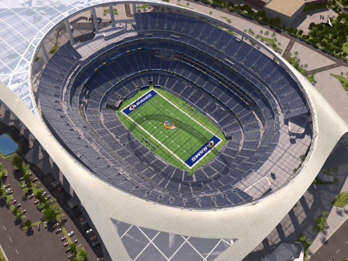
IMO the logo looks great in the stadium, but I guess I'm in the minority, however, with everything going on especially with the challenges in the State of New York, this took me away from work and for a few minutes deflected my attention away from world affairs and I feel strongly everything will come together in the new venue.

Last edited:
I think the logo looks awful in the center. You can't even tell what it is. Endzones look fine.IMO the logo looks great in the stadium, but I guess I'm in the minority, however, with everything going on especially with the challenges in the State of New York, this took me away from work and for a few minutes deflected my attention away from world affairs and I feel strongly everything will come together in the new venue.
View attachment 34884
I think the logo looks awful in the center. You can't even tell what it is. Endzones look fine.
Like the logo, but agree it looks bad at the 50. Maybe they should try blue letters.
Those are the 2nd worst (imo). I don't get the fascination; they're ugly.Look at it again. It's bitchin! Kinda similar to the charger's baby blues!
Everyone knows the 60's Cowboys 3/4 length sleeved double-star Cowboys jersey is the best to ever exist. Duh.
Got a pic of that 60's uniform?Those are the 2nd worst (imo). I don't get the fascination; they're ugly.
Everyone knows the 60's Cowboys 3/4 length sleeved double-star Cowboys jersey is the best to ever exist. Duh.
Those are the 2nd worst (imo). I don't get the fascination; they're ugly.
Everyone knows the 60's Cowboys 3/4 length sleeved double-star Cowboys jersey is the best to ever exist. Duh.
Speaking Cowboys unis, will Jerry ever scrap those toothpaste colored pants?
It's understandable to have those back when TV quality was shite.
I think the logo looks awful in the center. You can't even tell what it is. Endzones look fine.
IMO, it's because it's an aerial view, I'm sure at field level, it will look good....Or as the saying goes, the more you see it, the more you get used to it. It's like when my wife first cut her hair, didn't like it, however, as the years have moved forward, she looks amazing.
Ram is its own division of Fiat Chrysler now. They are no longer under the Dodge moniker.

The LA Karens is what I see with the LAC logo, and after seeing the image of the penis on the Rams head, it cannot be unseen. It's hard to be hyped or even "proud" to wear them lol.
