Rams Uniforms
- Thread starter RamUK
- Start date
-
To unlock all of features of Rams On Demand please take a brief moment to register. Registering is not only quick and easy, it also allows you access to additional features such as live chat, private messaging, and a host of other apps exclusive to Rams On Demand.
You are using an out of date browser. It may not display this or other websites correctly.
You should upgrade or use an alternative browser.
You should upgrade or use an alternative browser.
- Joined
- Jan 16, 2013
- Messages
- 22,546
- Name
- Dennis

.
bone all the way.
have the rams lost a game in the bone jerseys?
.
dang
Legend
- Joined
- Mar 15, 2018
- Messages
- 7,012
Blueberries got to go for multiple reasons.
nighttrain
Legend
- Joined
- Jan 12, 2013
- Messages
- 9,216
- Joined
- Apr 23, 2016
- Messages
- 1,994

As an award-winning graphic designer of 20 plus years, I’m going to start working on our next Rams head logo. Ours currently sucks. It needs more “fierce” added if you know what I mean.
Let’s get rid of the bone. It looks like crapola on the screen. Make the white throwbacks primary. Add the sol color rush jersey as an alternative. You all had the same thoughts I did.
Ditch the stupid gradient numbers. I’d ditch all gradients everywhere actually. They are problematic when producing them. There are ways to communicate gradients without using them. They are doing an old horns white to modern horn yellow. The gradient horns are the reason they did the gradient numbers. Simplify.
The round numbers are meant to go with the round horns. Bad idea. We need a more angular font for the numbers on the jerseys. Round is too soft. Soft is not suited for a gritty sport like football. At all.
Design by committee is a horrible thing. By the way, that design package probably cost the the Rams millions of dollars. That’s why it will be a while before any real changes occur, and why my new rams head logo will never get used. Oh well!
- Joined
- Jan 15, 2013
- Messages
- 8,400
- Name
- Erik
Well below .500 in the blue pants.
Burn them.
- Joined
- Jan 16, 2013
- Messages
- 22,546
- Name
- Dennis
As an award-winning graphic designer of 20 plus years, I’m going to start working on our next Rams head logo.
- Joined
- Jun 24, 2010
- Messages
- 34,043
- Name
- Stu
BrooklynRam
Rookie
- Joined
- Apr 6, 2022
- Messages
- 238
rdlkgliders
"AKA" Hugo Bezdek
- Joined
- Jul 1, 2013
- Messages
- 7,882
- Name
- Don
Agree, we need a more angular design, there was a remix of our logo somebody on here did and it addressed a lot of the oversights of our current dildo or I mean logo. I don't hate the bone as much as some others and the gradients, I don't know what they could have possibly been thinking. Let's see that logo design of yours, I would love to check it out. Design by committee is always a losing proposition. I see it fail time after time in my industry. It clearly expresses nobody's vision. Supporting someone's vision is very different than compromising it.As an award-winning graphic designer of 20 plus years, I’m going to start working on our next Rams head logo. Ours currently sucks. It needs more “fierce” added if you know what I mean.
Let’s get rid of the bone. It looks like crapola on the screen. Make the white throwbacks primary. Add the sol color rush jersey as an alternative. You all had the same thoughts I did.
Ditch the stupid gradient numbers. I’d ditch all gradients everywhere actually. They are problematic when producing them. There are ways to communicate gradients without using them. They are doing an old horns white to modern horn yellow. The gradient horns are the reason they did the gradient numbers. Simplify.
The round numbers are meant to go with the round horns. Bad idea. We need a more angular font for the numbers on the jerseys. Round is too soft. Soft is not suited for a gritty sport like football. At all.
Design by committee is a horrible thing. By the way, that design package probably cost the the Rams millions of dollars. That’s why it will be a while before any real changes occur, and why my new rams head logo will never get used. Oh well!

- Joined
- Jun 24, 2010
- Messages
- 34,043
- Name
- Stu
But not the hooves?@Loyal trying out Nike's next generation Rams pants in his back yard. Neighbors were a bit weirded out by the flute.
View attachment 54614
- Joined
- Jan 9, 2012
- Messages
- 3,809
- Name
- Eddy
cmon no hidden penis in logo, that's bush I tell ya!!!!
- Joined
- Jan 9, 2012
- Messages
- 3,809
- Name
- Eddy
nothing will ever beat this logo!!!! Its so awesome!!!!!
nighttrain
Legend
- Joined
- Jan 12, 2013
- Messages
- 9,216
- Joined
- Jun 28, 2010
- Messages
- 48,295
- Name
- Burger man

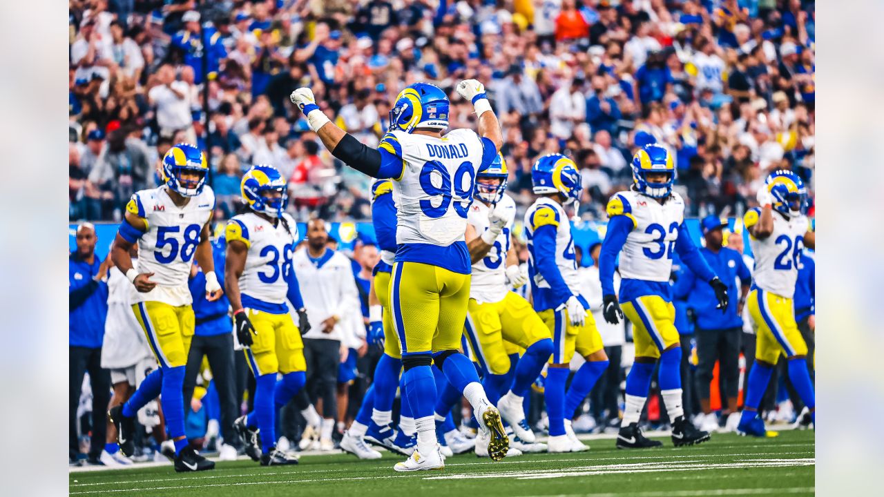
That is a great pic. POPS! Looks Great!Rams alternate jerseys ranked #1 in the NFL
https://www.cbssports.com/nfl/news/...s-top-impressive-collection-of-third-jerseys/
fearsomefour
Legend
- Joined
- Jan 15, 2013
- Messages
- 17,178
I never liked the gradient numbers.As an award-winning graphic designer of 20 plus years, I’m going to start working on our next Rams head logo. Ours currently sucks. It needs more “fierce” added if you know what I mean.
Let’s get rid of the bone. It looks like crapola on the screen. Make the white throwbacks primary. Add the sol color rush jersey as an alternative. You all had the same thoughts I did.
Ditch the stupid gradient numbers. I’d ditch all gradients everywhere actually. They are problematic when producing them. There are ways to communicate gradients without using them. They are doing an old horns white to modern horn yellow. The gradient horns are the reason they did the gradient numbers. Simplify.
The round numbers are meant to go with the round horns. Bad idea. We need a more angular font for the numbers on the jerseys. Round is too soft. Soft is not suited for a gritty sport like football. At all.
Design by committee is a horrible thing. By the way, that design package probably cost the the Rams millions of dollars. That’s why it will be a while before any real changes occur, and why my new rams head logo will never get used. Oh well!
Always looked like a 15U soccer team to me.
Kupped
Legend
- Joined
- Aug 5, 2021
- Messages
- 8,312
- Name
- Kupped
Because they look great and represent THIS Super Bowl winning team.Because they're reminiscence of the GREATEST SHOW ON TURF!
train
History is great… the present is pretty awesome.
nighttrain
Legend
- Joined
- Jan 12, 2013
- Messages
- 9,216
Traditions do have a place in historyBecause they look great and represent THIS Super Bowl winning team.
History is great… the present is pretty awesome.
train