Go right the fuck ahead.... . If you're not too busy shaking your fists at whippersnappers driving past your house.Care to take a poll of the board members on this?
Uniform change for 2026
- Thread starter ljramsfan
- Start date
-
To unlock all of features of Rams On Demand please take a brief moment to register. Registering is not only quick and easy, it also allows you access to additional features such as live chat, private messaging, and a host of other apps exclusive to Rams On Demand.
You are using an out of date browser. It may not display this or other websites correctly.
You should upgrade or use an alternative browser.
You should upgrade or use an alternative browser.


Love early Simpsons. "Jumped the shark" after season 10 or so.Go right the fuck ahead.... . If you're not too busy shaking your fists at whippersnappers driving past your house.
View attachment 75183
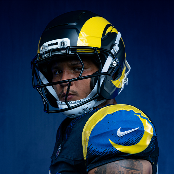
Actually, I feel like they may have metallic flake in em. Doesn't bother me. I think they pop. To each, their own.I’m surprised they didn’t put sparkles in the shiny blue of the helmet.
I say this as an almost 54 year old fart, lest anyone think I'm a whippersnapper.
")
To be clear, there are a LOT of things I don't dig about the new gear and logos. Not a fan of the LA Morning Show logo or the sleepy goat either. Hate the gradiant numbers... Wish the blue and yellow were a bit bolder, etc. I just don't hate the helmet.Love early Simpsons. "Jumped the shark" after season 10 or so.
To be clear, there are a LOT of things I don't dig about the new gear and logos. Not a fan of the LA Morning Show logo or the sleepy goat either. Hate the gradiant numbers... Wish the blue and yellow were a bit bolder, etc. I just don't hate the helmet.
Yeah and I'm sorry to be so intense about it. I could have lived with the 3D logo if they made the three dimensions more apparent and put some notches in the horns. It looks too Crescent Half Moon gay for me. Rams horns should be fierce and intimidating.
I imagine the change will be pretty minimal ,
I can see you going to work the next day and showing your non-Rams fans friends the new uniforms
and they'll go , what ?
whats different about them ?

I can see you going to work the next day and showing your non-Rams fans friends the new uniforms
and they'll go , what ?
whats different about them ?
I wonder if a color tweak is part of the new uniforms? That’s not been in the rumors, has it?I imagine the change will be pretty minimal ,
I can see you going to work the next day and showing your non-Rams fans friends the new uniforms
and they'll go , what ?
whats different about them ?
View attachment 75184
Your yellow is darker, and I think a general consensus from the 2020 rebrand was the yellow was too bright.
I would guess the blue and yellow will be the same as what is on the midnight uniforms because they were probably designed at the same timeI wonder if a color tweak is part of the new uniforms? That’s not been in the rumors, has it?
Your yellow is darker, and I think a general consensus from the 2020 rebrand was the yellow was too bright.
probably...........
maybe............
I don't know............
HEY DEMOFF
IF IT AIN'T BROKE, DON'T FIX IT

IF IT AIN'T BROKE, DON'T FIX IT
We NEED worse uniforms and helmet designs????
Great song, love it, but bad example.
Hey, I am pounding the table to go back to the Ferragamo's, but I recognize, it is most likely not going to happen. Still love the team so they still give me what I need, but I did not get what I wanted. That was my rational for the comparison FWIW.We NEED worse uniforms and helmet designs????
Great song, love it, but bad example.
Hey, I am pounding the table to go back to the Ferragamo's, but I recognize, it is most likely not going to happen. Still love the team so they still give me what I need, but I did not get what I wanted. That was my rational for the comparison FWIW.
Yes the team gives us what we need, but hate to nitpick, not for the uniform example. We Are forever worse off and scarred for life for bone, gradients, and crescent moon feminine horns.
That I 100% agree withYes the team gives us what we need, but hate to nitpick, not for the uniform example. We Are forever worse off and scarred for life for bone, gradients, and crescent moon feminine horns.
The longer the Rams drag this out….the more cringy this rebrand will be

I am expecting:The longer the Rams drag this out….the more cringy this rebrand will be
- Elimination of the gradient
- No dicknose logo (but skeptical the art class team knows how to make an NFL RAMS logo)
- A new alternate helmet, with corresponding jersey match. Probably blue and white.
I still find this whole topic crazy. The Rams do EVERYTHING AMAZING but can’t seem to figure out the uniforms. WTF
I am expecting:
No main color changes; still royal and lemon yellow from the 2020 rebrand.
- Elimination of the gradient
- No dicknose logo (but skeptical the art class team knows how to make an NFL RAMS logo)
- A new alternate helmet, with corresponding jersey match. Probably blue and white.
I still find this whole topic crazy. The Rams do EVERYTHING AMAZING but can’t seem to figure out the uniforms. WTF
73-99's (Ferragamo's, Dickerson's, McCutcheon's'sss) Primary
64-72's (Deacon's, Merlin's Roman's) Alternate
Was never that hard, in fact, was the easiest assignment on the face of the Earth after the return to Los Angeles.
I know, I know, 20-year hiatus, appeal to newer younger fan base, cutting edge, Gen Z, etc etc, etc.
Last edited:
El Chapo Jr
Legend

LARAMSinFeb.
Legend
That really does sum it up.I still find this whole topic crazy. The Rams do EVERYTHING AMAZING but can’t seem to figure out the uniforms. WTF
This^ in every shape, way & form.73-99's (Ferragamo's, Dickerson's, McCutcheon's'sss) Primary
64-72's (Deacon's, Merlin's Roman's) Alternate
Was never that hard, in fact, was the easiest assignment on the face of the Earth after the return to Los Angeles.
I know, I know, 20-year hiatus, appeal to newer younger fan base, cutting edge, Gen Z, etc etc, etc.