fearsomefour
Legend
That division was bizarre. NFC West....not quite.Back to the old Coastal Division ......... with ATL, NO, SF and the Rams in it?
God, those Saints defenses with Ricky Jackson and Swilling would terrorize Everett at times.
That division was bizarre. NFC West....not quite.Back to the old Coastal Division ......... with ATL, NO, SF and the Rams in it?
Gaining fans by changing the uniform.....the Steelers, Cowboys, Forty Niners, Bills, Packers and others disagree.I guess many don't get that the Rams have to attract new fans in the stands. Unfortunately that does require modernization to uniforms from time to time. The horns are fine although I do agree they should loop all the way around. Bunch of old farts here just wanna go back to the future and have the old school unis is hilarious. If I were the Rams, I'd put out my new stuff plus threw in some refreshed old school throwbacks (wear maybe 2-3 times per year of allowed) to try to capture all fans if possible. Just my 2 cents.
Modernization only means updating the look to me. I'm just talking about the idea of it and why I understand it. All those teams have done so but thru minor tweaks. The Rams decided to go thru much bigger ones as they left So Cal for so many years. I get it and as much as I love the old school look, I also love the new look helmets as well. The horn is here to stay as they went with a more 3D look for it and I think its dope. I'd like them to curl up more and around at the end but we'll see.Gaining fans by changing the uniform.....the Steelers, Cowboys, Forty Niners, Bills, Packers and others disagree.
Its only about winning and building roots in a place.
The uniforms might generate some revenue but thats about it.
As an old fan, Im fine with all of it except the horn.
It should go all the way around otherwise it just looks like a C to me.
The logo with the LA in it is lame as well.
Looks like a last minute rush job. The best logos to me speak for themselves.....the Vikings horn, Steelers emblem, the Cowboy star....dont need the name of the city anywhere in there. The Rams have great logo options with the rams head/horn.
Hell, make a bunch of different logo stuff with and without the LA.
Generally I like the newer unis just fine....except the horn.
The radiant numbers I hated but gotten used to them. Still look like a girls 16u soccer team numbers to me.
Either way........as long as the horn stays, they can only mess up so badly.
Its a classic look.
Disagree, but its not some deal breaker for me. I think the helmets still look cool.Super super super duper lame.
Widen the sleeve horns instead of it coming into a tip. Need them like the 80’shere's my guess of what the new uniforms will look like

Truth is, they have grown on me.Disagree, but its not some deal breaker for me. I think the helmets still look cool.
With the smaller sleeves compared to the 80s, they need to wrap the horn around the body of the jersey so the tip of the horn is around the lat muscle. You get a modern look on a timeless classic and you have the wide horns that don't fit on the modern sleeve.Widen the sleeve horns instead of it coming into a tip. Need them like the 80’s
Not a fan of the round numbers. The numbers pictured are perfect. I'd take those uni's in a heart beat, even with the broken horn since its not going away.Still sure they'll have the round numbers like midnight uniforms , but these are cool
View attachment 74975
Yep, looks like stuff from the old Sears Christmas catalog.
Agreed.
I only buy the team issued jerseys...... I like the fact they are made in the USA and they are made like tanks. Ya they can cost in upwards of $300-$500 but well worth the investment.
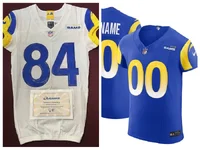
The blue jersey you pictured is a Vapor Elite made in Honduras. Those are nice jerseys but not team issue. The white jersey is a team issue.... I know the difference as I have 10 teams issues jerseys. The team issues are cut in all different lengths in accordance to the individual player requestI just wanna point out, because I see this sometimes. Those $385 jerseys *are not* the same as the team issued jerseys. They are very nice quality, that combines elements from on-field jerseys. But you’ll notice the description online says “For fans who want to get closest to what the players wear on the field.” Keyword is “closest”. If you search for a “game worn” Rams jersey on eBay, you will find that actual team issued jerseys run much longer so they can remain tucked in. The sleeves are almost nonexistent
The blue jersey you pictured is a Vapor Elite made in Honduras. Those are nice jerseys but not team issue. The white jersey is a team issue.... I know the difference as I have 10 teams issues jerseys. The team issues are cut in all different lengths in accordance to the individual player request
I have been really disappointed in the selection of Rams jerseys at the NFL sites. They only sell the blue Vapor Elites now and have only for the last three years. Rams Marketing Team blows.Nice dude , yeah the blue one I pictured was what I thought you meant by team issue given that’s roughly what they sell for. Many people mistakenly believe they are the same as the team. Obviously you know better.
I had that bed spread as a kid back in the late 70's early 80's.
That looks legit, unless AI.Saw these screen shots on Twitter. Kevin Dotson doing promo work in Australia aparently (but I could be wrong on location). Anyhow. Interesting logo on his hat.
View attachment 74977View attachment 74978