Rams logo a no-go. Favorites?

  • To unlock all of features of Rams On Demand please take a brief moment to register. Registering is not only quick and easy, it also allows you access to additional features such as live chat, private messaging, and a host of other apps exclusive to Rams On Demand.
Seattle Kraken chose poorly had some cool designs
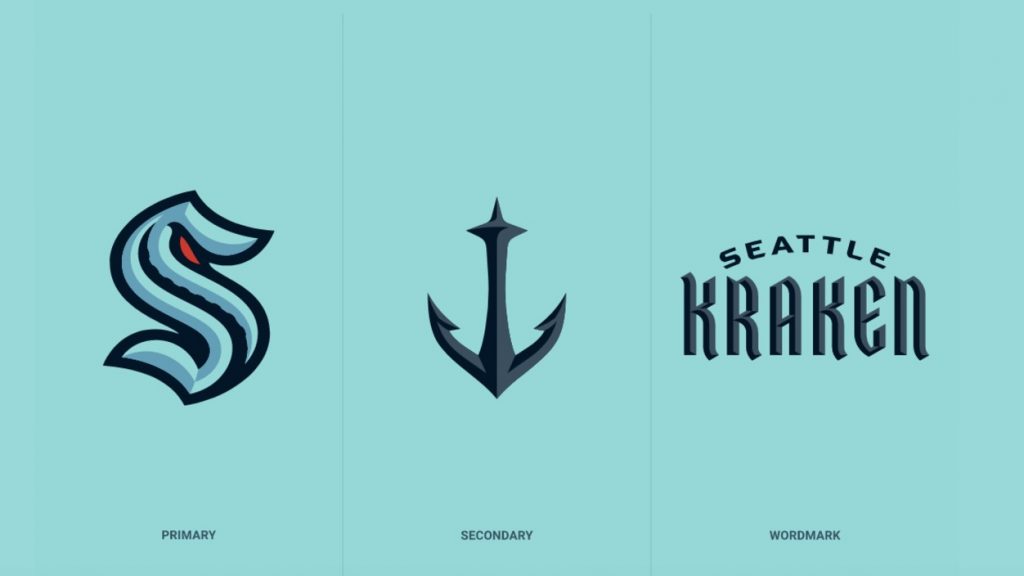
Seattle-Kraken-logos-1024x576.jpg


Official

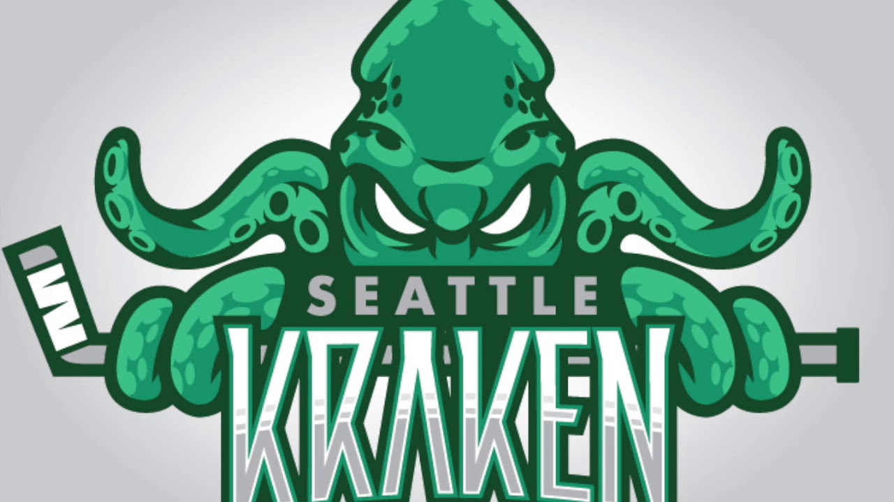
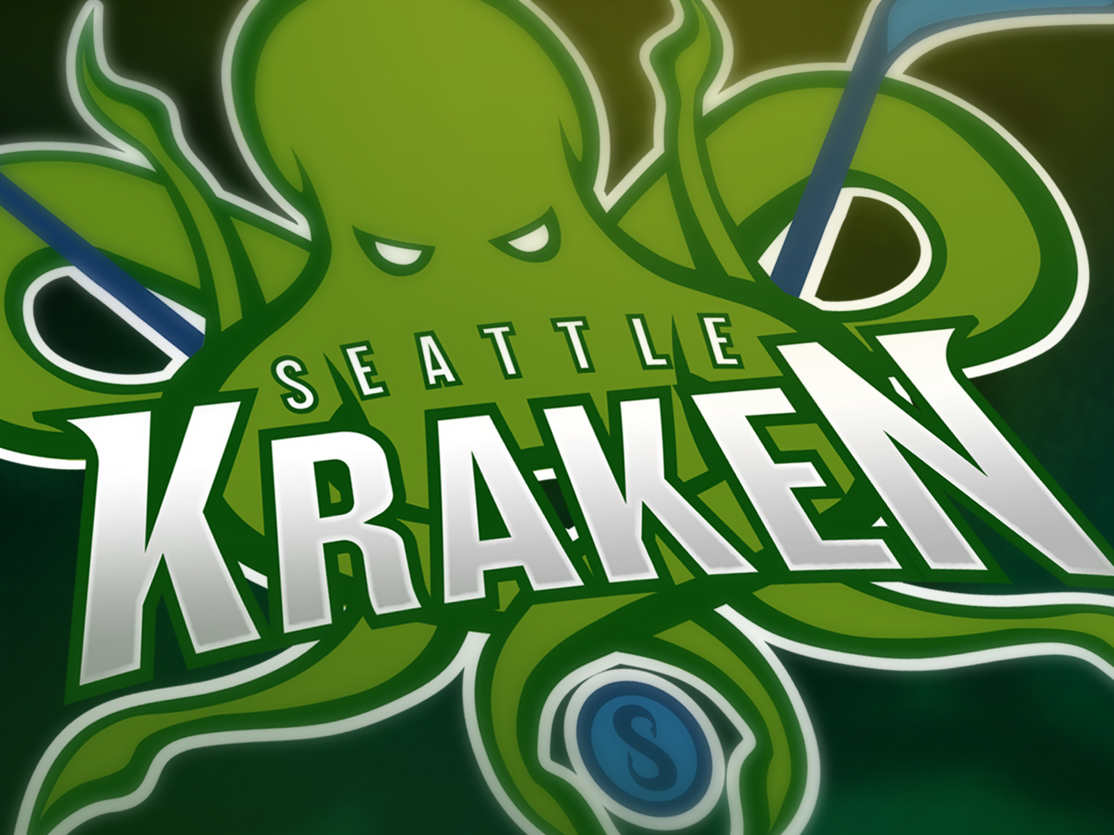
But some alternatives were better
maxresdefault.jpg


kraken-cover-photo.jpg


seattlekraken_illvisual.png


0322-christianlegault-kraken2.png


ELhCd3yWsAApQ4s.jpg
 
So instead in wallowing in the pit of despair over the logos introduced, I pondered logos I like.


View attachment 34934

Personally I'm still pissed off at the Rams logo, and now more so because the NFL network has returned to my YoutubeTV lineup and I see it all the time whenever there are scores or highlights.

I'm offended every single time. It still just sucks.

Good thing the Rams do a better job of running the football operation and building stadiums.
 
I expect minor tweaks to the new unis and big tweaks to the logos as soon as this offseason.
Obviously they could be totally deaf to public opinion, but I seriously doubt it. They want to sell as much merchandise as possible and if they missed the mark (and they def did with the logos) then my guess is they will try to fix it when nobody is paying attention.
 
NFL: Fearsome Foursome Rams, Packers, Bears, Steelers

MLB: Dodgers, Yankees (as much as I hate them, the pinstripes are about as iconic as it gets)

NBA: Lakers, Celtics, 76ers

XFL: Roughnecks

NHL: Penguins, Blues, Redwings, Canadiens, Bruins, Blackhawks
 
  • Cheers
Reactions: nighttrain
I expect minor tweaks to the new unis and big tweaks to the logos as soon as this offseason.
Obviously they could be totally deaf to public opinion, but I seriously doubt it. They want to sell as much merchandise as possible and if they missed the mark (and they def did with the logos) then my guess is they will try to fix it when nobody is paying attention.
You can bet they will make changes IF they do not sell well. I don't hate them at all anymore, and my 24 year old son and other peeps his age are supposedly fine with it.

I doubt they will change anything because of a small ratio of old codgers like some of us here have sandy private areas. I hated the logo when it leaked on that hat, but am OK with it now..... Always liked the "dick head" logo so many of yall are angry about, but again... I never saw a fallace in that logo and still don't... But that's just me.
 
  • Like
Reactions: badnews
Okay, so it's logos you want? The St. Louis Cardinals. Best logo in the MLB, in my honest opinion, and easily the most iconic. Everyone who's into baseball knows about the birds on the bat.

I might be a tad biased, but I like the Dodger logo and the fact they as an organization was always ahead of the curve.
1600804754178.png
 
Went there as well - got out in '73 Always wish I'd have stayed there.
I had to leave to Silicon Valley since I couldn't work anywhere near SLO with my Comp Sci Degree. Ironic that had a graduated now, with COVID and other WFH initiatives that save corporations rent money, I could probably have lived there. I am working from home now, but have kids to consider...

Awesome location.
 
I might be a tad biased, but I like the Dodger logo and the fact they as an organization was always ahead of the curve.
View attachment 39179

They were definitely ahead of the curve, and some of the Cardinals (looking at you, Enos Slaughter) weren't. But the birds on the bat have been there since the early 1900s. I'd say that the Cardinals, Yankees, and Dodgers have to be top three in some order.
 
Also, while on topic, I love the Mizzou logo. The tiger looked beautiful, dangerous, cool, just everything you want a logo to look like.

1600806215186.png
 
Last edited: