Agreed.Is this what the field will look like? I'd rather see the RAMS head or helmet at midfield.
View attachment 34778
End zones are good. Put the goddamn Rams head at midfield. Why try to sell a logo if you don't put it on the field. Amiright?
Agreed.Is this what the field will look like? I'd rather see the RAMS head or helmet at midfield.
View attachment 34778
"Don't worry it's not the hat.."
View attachment 34781
Maybe they won't notice?
View attachment 34782
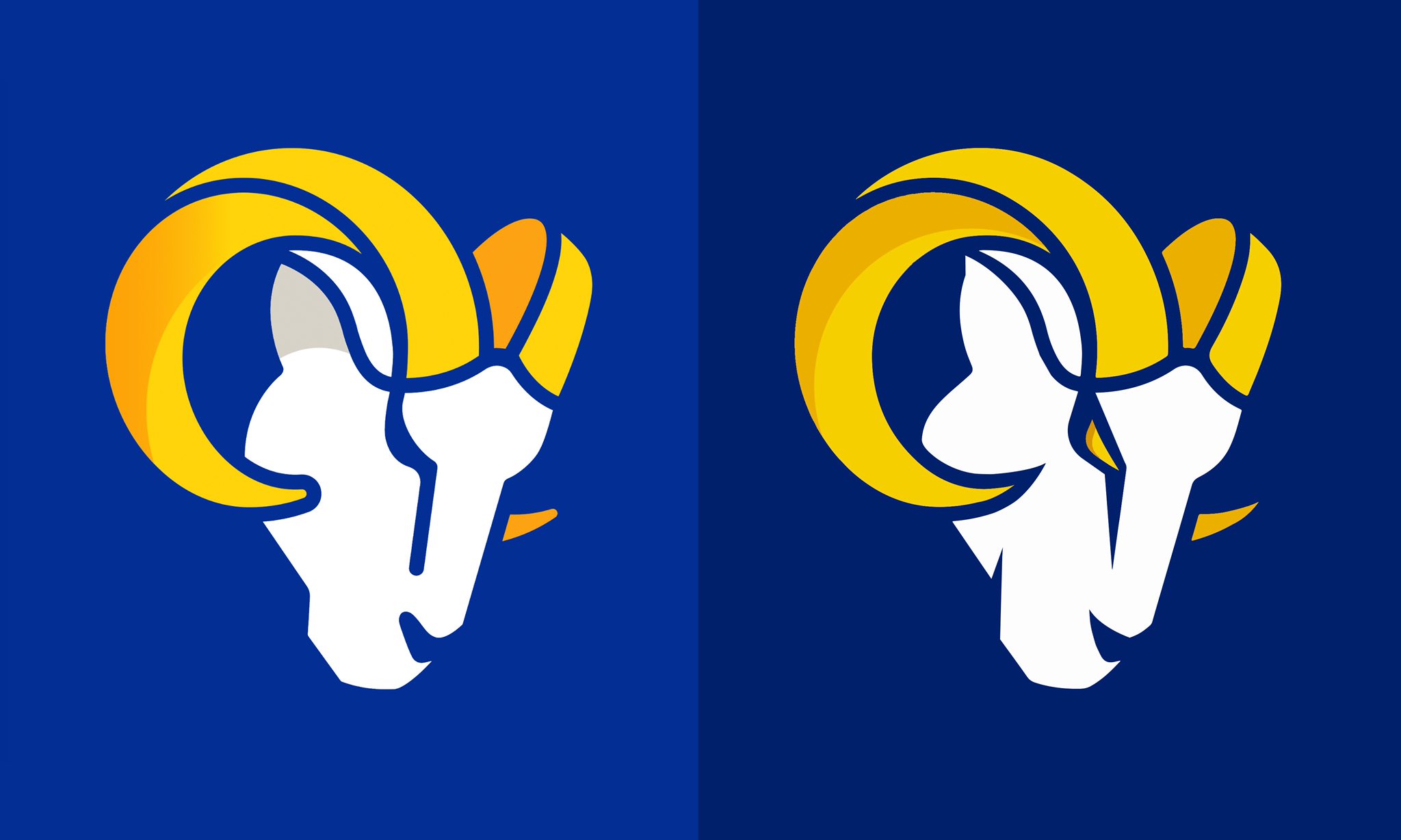
For the record I don't mind the logos, I like the colors, I think that they'll really pop on the uniforms. Though I do wonder about the horns on the helmet.
I'd say you'll eventually stop seeing it, but it's 30 years later and I still see "Sex" when I see the the White Sox logo.I like the modern take on the Ram head.
the LA banana thing bothers me but I will give it time.
Colors are great!
I liked the Jets new look too! Many on here bitched about it though!Not me, that Jets look is probably the best in the league.
Took a guy five minutes on twitter to improve it ten fold.The yellow eye looks way better!
Lipstick on a pig...lipstick on a pig! (lol)
OMG...that's awful! We're so screwed!Is this what the field will look like? I'd rather see the RAMS head or helmet at midfield.
View attachment 34778
The ones I looked at weren't shipping for a few weeks anyways. They'll probably have a bigger selection by then as well.Yeah, I’ll need a Rams head hat when they’re back in stock
It's a Cougar with horns drawn on it...not a Ram!I'm starting to like it.

This looks soooo much better with the eyesThe yellow eye looks way better!

