Midnight Mode
- Thread starter Faceplant
- Start date
-
To unlock all of features of Rams On Demand please take a brief moment to register. Registering is not only quick and easy, it also allows you access to additional features such as live chat, private messaging, and a host of other apps exclusive to Rams On Demand.
You are using an out of date browser. It may not display this or other websites correctly.
You should upgrade or use an alternative browser.
You should upgrade or use an alternative browser.
If you don't like it, don't buy it....BUT plenty people will......Can't believe people fall for all this marketing BS and buy this ugly SH.
Corporate America has destroyed this country.
Way to go Demoff. Your uni color scheme has single handedly destroyed what the British/Germans/Japanese/ Russian/Chinese have tried but failed to do since 1776.Can't believe people fall for all this marketing BS and buy this ugly SH.
Corporate America has destroyed this country.
Agreed but this isn’t the place to get into all that. CheersCorporate America has destroyed this country.
I'm the one with not so sure emoji. I'm very curious about the upcoming sales numbers. It seems to me they just threw in a bunch of different things that don't match.If you don't like it, don't buy it....BUT plenty people will......
Meh, they're ok I guess, IMO all 8 of the new Rivalries unis look similarly ridiculous. Coulda been worse, they might grow on me. As an old school fan, all I really want are the 70s Ferragamos back.
Here's an interesting view of all 8:
View: https://www.tiktok.com/t/ZT6puy5ae/
Damn near every one of those uniforms is a downgrade. Exceptions being Seattle's uniform since their normal flourescent greens are so fucking ugly that this other weird green is actually an upgrade. And Buffalo's cleaner look is better than the blue and red which I have never been a fan of in combination on any uniform, though I agree they won't be able to see their wideouts in the snow lol.
The Rams continue to fuck up the shoulders when all they need is a motherfucking horn. The blue contrast gives them a "puffy sleeves" princess type look. Hideous. Really the shame for the Rams is they could have boosted some merch sales massively with a good product. These will sell a little, but not anything like what it could have been if they'd done it right. Which, to me would be dark navy blues with reflective gold and call them the Hollywoods.
NFL needs to divorce itself from Nike. Having one supplier is not good for the league. Would be way better if there was some competition, because these jerseys overall fucking suck.
LARAMSinFeb.
Legend
Yellow would've been too Rams-ish.Much much better with the right lighting. Still don't understand why the white numbers instead of yellow though.
pvtdragon39
Pro Bowler
Classic Rams
Hall of Fame
Not digging on you because that's all we have here, but the not so sure icon is such a weak way to show we disagree with anyone. Well I'm absolutely 100% sure that I hate these crummy alternates. They don't even look like the same Rams I came aboard with back in the day. I really don't understand someone who has to change a very good thing that we had which was the best uniforms in the league. I just don't get it. A decision I made when I took on the Rams was those helmets and jerseys were so cool I must have every photo of them!!! These ugly ass alternates make me want to cheer for them to lose in so I won't see them again. I felt the same about the Lakers black mambas. Why add black when those aren't your colors? Stick with tradition. Nothing was wrong with one helmet, one away jersey, and one home jersey. Yes get off my lawn! Lighten up, Francis! And don't fuck with my uniforms!!!I'm the one with not so sure emoji. I'm very curious about the upcoming sales numbers. It seems to me they just threw in a bunch of different things that don't match.
LARAMSinFeb.
Legend
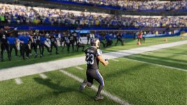
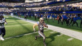
Apparently there aren’t a lot of Rams fans employed at Nike.This is what our new Jerseys look like in Madden26 at 1:25pm.
There aren't many sports fans at Nike. They're a shit organization on the way down. If I was a young and enterprising college grad today, creating a business to rival them or Puma would be top of the list. In business when you have an established brand that is running at probably 60% of the original efficiency with which it won its market share, and where its European counterpart has followed suit to large part, what you call that is opportunity knocking.Apparently there aren’t a lot of Rams fans employed at Nike.
This is probably the best era ever for the college grads who have actual functioning brains. That rare percentage that are yet to realize the massive opportunities that await them in so many fields due to the trend to promote execs for other-than their talent. This is the type of window we haven't seen for many years, as it pertains to new businesses rising. So many underperforming companies in vid game devs, movie and tv studios, sports branding and advertisement, etc. You could even make a killing by opening a food service company nowadays by simply hiring managers who hold employees accountable and thus serve their customers faithfully.
pvtdragon39
Pro Bowler
Im leaning towards the dislike side. I want to like them but like it was said previous by someone else, its not the rams. I thought the Rivals jerseys are supposed to represent your history?
Oh my god you guys they’re wearing the jerseys for one damn game and some people are having commentary on the breakdown of society lol
Dont know about you fellas
but the new uniform looks pretty OK to me


but the new uniform looks pretty OK to me
IMO this would have been much sweeter.
But, maybe they do something like this with the alternate helmet and new jersey in 2026.
View: https://x.com/rclemente2121/status/1983713793663504675?s=61&t=lgp1gRmUcyNSF5v7CIHwMg
But, maybe they do something like this with the alternate helmet and new jersey in 2026.
View: https://x.com/rclemente2121/status/1983713793663504675?s=61&t=lgp1gRmUcyNSF5v7CIHwMg
Doesn't matter to me. I like em all. The yellow color rush. The classic blue and whites. The Ferragamo's. I bought one of the Super Bowl Bound black with blue numbers and letters outlined in yellow. Ironically, the only uniforms I didn't like were the new ones in 2000. They were terrible. I know they were looking for something to go with Max-Q but they sucked. Seemed metallic to me. Just got my daughter a midnight mode Puka jersey this month for her birthday.
I don't know.... they look XFL-ish to me..... If I can get a team issue or game used one I'll get it.... if not I'll sit this one out.
Last edited:


