- Joined
- Jan 16, 2013
- Messages
- 23,315
- Name
- Dennis

Uniform redesigns have become commonplace in the NFL with Nike taking over as the official outfitter of the league in 2012. There have been some welcome changes, like the Bills’ and Lions’ new looks, as well as some flops, such as the Buccaneers’ alarm clock numbers and the Jaguars’ gradient helmets that went along with their 2013 redesgin.
The most recent team to get its uniforms overhauled is the New York Jets. Their rebranding was unveiled on Thursday night, featuring a new primary green color, all-new black uniforms and a slightly different logo.
The Jets’ old uniforms needed an update, but many believe the new look is a step in the wrong direction – much like the Jaguars’, Browns’ and Tampa Bay’s were – receiving an abundance of criticism on Twitter (as most things do).
The stripes on the shoulders look strange, the green is reminiscent of the Saskatchewan Roughriders and the “New York” writing above the numbers just … doesn’t fit. There are simple elements to the uniforms, but as a whole, they just don’t work.
The next team in line to receive an update is the Rams. Along with moving into their spectacular new Inglewood stadium next year, the Rams will also unveil a uniform refresh in 2020. It was originally supposed to happen this year, but they pushed it back to coincide with the stadium’s opening.
The Jets’ redesign has many Rams fans worried that Nike will screw up their team’s uniforms, too. As legitimate of a concern as that may be, it should be extremely difficult for Nike and the Rams to get this redesign wrong. There’s a lot to be learned from the Jets’ whiff on Thursday.
For Los Angeles, the simpler, the better. Fans nowadays love nostalgia. People are calling for the Eagles to wear their classic Kelly green uniforms. Everyone was asking the Rams to wear their throwbacks more often. There’s even a huge group of fans who want to see the Bucs’ creamsicle look back in the rotation.
There’s no reason for the Rams to completely overhaul their current slate of uniforms. They don’t need to go all futuristic and try to tend to the younger audience with edgy jerseys and contemporary helmets. With Nike at the helm, there has to be some concern about that happening.
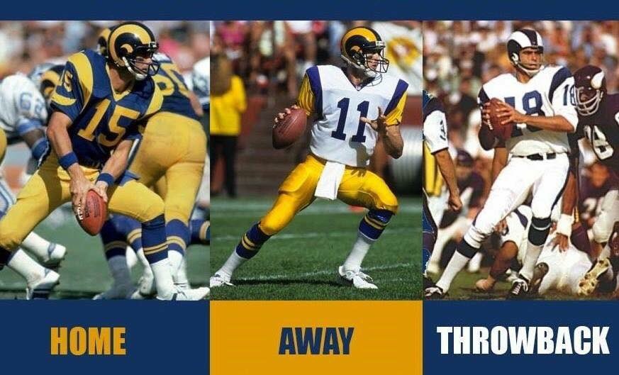
But Los Angeles’ uniforms are already great now that the league has allowed the throwback blue and yellow threads to be the team’s primary ones. In fact, there’s a large contingent of fans that would be perfectly fine if the team just kept the throwbacks as its primary uniforms moving forward. That most likely won’t happen, but the blueprint for the Rams’ redesign is already there. It just needs some touch-up paint.
Graphic designers have come up with a slate of uniform concepts the Rams should absolutely use as the basis for the refresh.
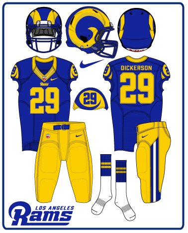

Simple. Clean. Classic.
Granted, these weren’t designed by the same artist, so they don’t perfectly match one another, but the point remains the same: Not much change is needed to the Rams’ current uniform set.
The removal of gold is a must. Their current away uniforms feature navy blue and gold trimming, which doesn’t at all match their primaries or alternates. All the Rams really need to do to fix that is change the gold to yellow and throw on some yellow pants.
Something like this would be absolutely perfect as away uniforms for the Rams.

Some want to see white and blue alternate uniforms replace the yellow Color Rush holdovers. It would pay homage to the ones the Rams wore from 1964-72 before the team went back to blue and yellow. That’s not a bad idea and would be a nice touch, piquing the interest of fans from every generation. But then you run into the issue of having two different color blues featured across the wardrobe.
Regardless of what the Rams decide, this redesign shouldn’t be hard. In fact, it shouldn’t even be called a redesign; it’s more of a refresh. There’s no need to change the horns or the logo or the primary colors. And that’s unlikely to happen, if Kevin Demoff’s comments hold true.
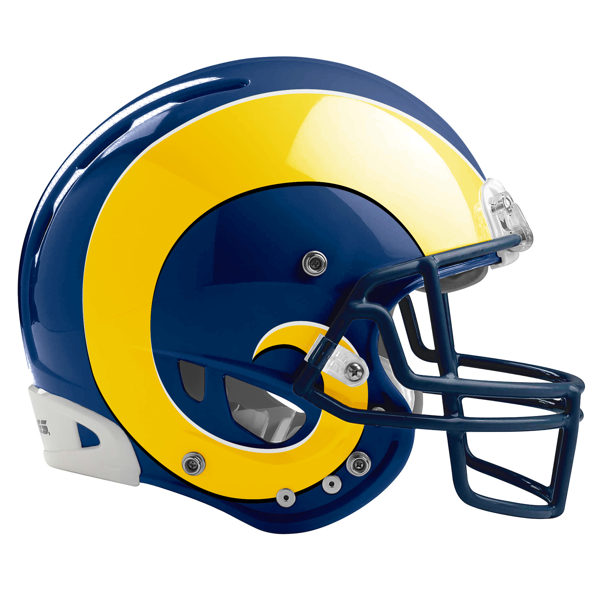
“We’ve told Nike the one thing that is sacrosanct is the horns,” Demoff said in February. “The goal is a modern take on our historical jerseys.”
The Rams can learn a lot from the flop that was New York’s unveiling. Out-of-place stripes and a new color scheme don’t exactly work. In sports today, fans want teams looking back more than forward – which seems contradictory to the everchanging world of technology.
[theramswire.usatoday.com]
This shouldn’t be a difficult decision in L.A. It should be almost impossible to mess up.
The most recent team to get its uniforms overhauled is the New York Jets. Their rebranding was unveiled on Thursday night, featuring a new primary green color, all-new black uniforms and a slightly different logo.
The Jets’ old uniforms needed an update, but many believe the new look is a step in the wrong direction – much like the Jaguars’, Browns’ and Tampa Bay’s were – receiving an abundance of criticism on Twitter (as most things do).
The stripes on the shoulders look strange, the green is reminiscent of the Saskatchewan Roughriders and the “New York” writing above the numbers just … doesn’t fit. There are simple elements to the uniforms, but as a whole, they just don’t work.
The next team in line to receive an update is the Rams. Along with moving into their spectacular new Inglewood stadium next year, the Rams will also unveil a uniform refresh in 2020. It was originally supposed to happen this year, but they pushed it back to coincide with the stadium’s opening.
The Jets’ redesign has many Rams fans worried that Nike will screw up their team’s uniforms, too. As legitimate of a concern as that may be, it should be extremely difficult for Nike and the Rams to get this redesign wrong. There’s a lot to be learned from the Jets’ whiff on Thursday.
For Los Angeles, the simpler, the better. Fans nowadays love nostalgia. People are calling for the Eagles to wear their classic Kelly green uniforms. Everyone was asking the Rams to wear their throwbacks more often. There’s even a huge group of fans who want to see the Bucs’ creamsicle look back in the rotation.
There’s no reason for the Rams to completely overhaul their current slate of uniforms. They don’t need to go all futuristic and try to tend to the younger audience with edgy jerseys and contemporary helmets. With Nike at the helm, there has to be some concern about that happening.
But Los Angeles’ uniforms are already great now that the league has allowed the throwback blue and yellow threads to be the team’s primary ones. In fact, there’s a large contingent of fans that would be perfectly fine if the team just kept the throwbacks as its primary uniforms moving forward. That most likely won’t happen, but the blueprint for the Rams’ redesign is already there. It just needs some touch-up paint.
Graphic designers have come up with a slate of uniform concepts the Rams should absolutely use as the basis for the refresh.


Simple. Clean. Classic.
Granted, these weren’t designed by the same artist, so they don’t perfectly match one another, but the point remains the same: Not much change is needed to the Rams’ current uniform set.
The removal of gold is a must. Their current away uniforms feature navy blue and gold trimming, which doesn’t at all match their primaries or alternates. All the Rams really need to do to fix that is change the gold to yellow and throw on some yellow pants.
Something like this would be absolutely perfect as away uniforms for the Rams.

Some want to see white and blue alternate uniforms replace the yellow Color Rush holdovers. It would pay homage to the ones the Rams wore from 1964-72 before the team went back to blue and yellow. That’s not a bad idea and would be a nice touch, piquing the interest of fans from every generation. But then you run into the issue of having two different color blues featured across the wardrobe.
Regardless of what the Rams decide, this redesign shouldn’t be hard. In fact, it shouldn’t even be called a redesign; it’s more of a refresh. There’s no need to change the horns or the logo or the primary colors. And that’s unlikely to happen, if Kevin Demoff’s comments hold true.
“We’ve told Nike the one thing that is sacrosanct is the horns,” Demoff said in February. “The goal is a modern take on our historical jerseys.”
The Rams can learn a lot from the flop that was New York’s unveiling. Out-of-place stripes and a new color scheme don’t exactly work. In sports today, fans want teams looking back more than forward – which seems contradictory to the everchanging world of technology.
[theramswire.usatoday.com]
This shouldn’t be a difficult decision in L.A. It should be almost impossible to mess up.


