What intrigues me

  • To unlock all of features of Rams On Demand please take a brief moment to register. Registering is not only quick and easy, it also allows you access to additional features such as live chat, private messaging, and a host of other apps exclusive to Rams On Demand.

VegasRam

Give your dog a hug.
Rams On Demand Sponsor
Joined
Sep 7, 2011
Messages
3,931
Name
Doug
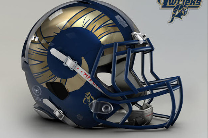
a bit about this helmet design is not its Star Wars connection,
onufuhp.0.png

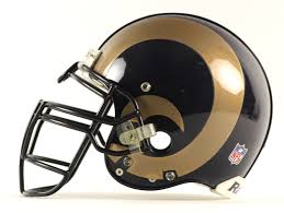
but the way they shortened up the horn. At present, it slides under the earhole, which gives it a somewhat elongated shape that's always bothered me.
images


Actually, this one is too short, but wouldn't mind seeing the end of the horn pass through the earhole.
And before y'all come after me, not suggesting changing it, just makin' conversation.
 

A55VA6

Legend
Joined
Mar 9, 2013
Messages
8,208
I think changing up the size or look of the horns on the helmets would be cool. Make it a bit more modern looking.
 

Loyal

Rams On Demand Sponsor
Joined
Jul 27, 2010
Messages
30,557
Hell no..Give me Blue and White, dammit!:rockon:
 
Last edited:

RamFan503

Grill and Brew Master
Moderator
Joined
Jun 24, 2010
Messages
34,840
Name
Stu
a bit about this helmet design is not its Star Wars connection,
onufuhp.0.png

but the way they shortened up the horn. At present, it slides under the earhole, which gives it a somewhat elongated shape that's always bothered me.

images


Actually, this one is too short, but wouldn't mind seeing the end of the horn pass through the earhole.
And before y'all come after me, not suggesting changing it, just makin' conversation.

Those first horns look too puny. They may be more realistically curved but they look weak. I never liked how they thinned the horns with the current shape and the size of the base of the horn in the more modern design is unnaturally thin. I'd be ok with the horns taking up more room on the helmet and being beefier at the base of the horn.

Also, what are those graphics on the horns? Bandages? So we have weak little goat horns that have been ravaged by who knows what? No likey.
 

shovelpass

Hall of Fame
Joined
Aug 4, 2014
Messages
4,575
Those first horns look too puny. They may be more realistically curved but they look weak. I never liked how they thinned the horns with the current shape and the size of the base of the horn in the more modern design is unnaturally thin. I'd be ok with the horns taking up more room on the helmet and being beefier at the base of the horn.

Also, what are those graphics on the horns? Bandages? So we have weak little goat horns that have been ravaged by who knows what? No likey.
Not to "nerd out" but those are not horns in the graphic. They are infact tentacles. The image is from a Star Wars- NFL Helmet concept page. There is a race of people in Star Wars that have tentacles on their heads, usually wrapped or adorned with a headdress which explains the "bandages". You can see the word Twi'lek in the upper right corner, that is the race of people. VegasRam is just pointing out that he likes how short the "horn" is, and how it looks better than our horn that loops around the ear hole.
 

VegasRam

Give your dog a hug.
Rams On Demand Sponsor
Joined
Sep 7, 2011
Messages
3,931
Name
Doug
  • Thread Starter Thread Starter
  • #8
Knew this would happen. Sigh.

Let me start again.

I'm talking about the SHAPE of the fucking horn. Not the size. Not the bullshit graphics. THE SHAPE.

The SHAPE of the horn is PERFECT.

(The SHAPE of the existing horn is not - please refer to the graphic above. If you do not see this , then I do not know what else to say).

The SIZE needs to be bigger.
It needs to be larger as in its CIRCUMFERENCE.

THAT would mean that the end of the RAMS horn would then intersect with the earhole.

With me so far?
 

RamFan503

Grill and Brew Master
Moderator
Joined
Jun 24, 2010
Messages
34,840
Name
Stu
Knew this would happen. Sigh.

Let me start again.

I'm talking about the SHAPE of the freaking horn. Not the size. Not the bullcrap graphics. THE SHAPE.

The SHAPE of the horn is PERFECT.

(The SHAPE of the existing horn is not - please refer to the graphic above. If you do not see this , then I do not know what else to say).

The SIZE needs to be bigger.
It needs to be larger as in its CIRCUMFERENCE.

THAT would mean that the end of the RAMS horn would then intersect with the earhole.

With me so far?
Well why didn't yuh fuckin' say so? :cool: But why are the horns so small?
 

A55VA6

Legend
Joined
Mar 9, 2013
Messages
8,208
Knew this would happen. Sigh.

Let me start again.

I'm talking about the SHAPE of the freaking horn. Not the size. Not the bullcrap graphics. THE SHAPE.

The SHAPE of the horn is PERFECT.

(The SHAPE of the existing horn is not - please refer to the graphic above. If you do not see this , then I do not know what else to say).

The SIZE needs to be bigger.
It needs to be larger as in its CIRCUMFERENCE.

THAT would mean that the end of the RAMS horn would then intersect with the earhole.

With me so far?
We get what you're saying... but we can have our own opinions on what the helmet should look like.
 

RaminExile

Hall of Fame
Joined
Sep 29, 2013
Messages
3,065
I agree with Vegas. I like the rounded, more realistic shaped horn. Don't care for the design however.
 

Ramrasta

(╯°□°)╯︵ ┻━┻
Joined
Sep 7, 2010
Messages
3,208
Name
Tyler
Shorter horns would look better. I would even say slightly raising the horn on the helmet would really bring it to life.
 

LesBaker

Mr. Savant
Joined
Aug 23, 2012
Messages
17,460
Name
Les
Knew this would happen. Sigh.

Let me start again.

I'm talking about the SHAPE of the freaking horn. Not the size. Not the bullcrap graphics. THE SHAPE.

The SHAPE of the horn is PERFECT.

(The SHAPE of the existing horn is not - please refer to the graphic above. If you do not see this , then I do not know what else to say).

The SIZE needs to be bigger.
It needs to be larger as in its CIRCUMFERENCE.

THAT would mean that the end of the RAMS horn would then intersect with the earhole.

With me so far?

I don't understand. :whistle:
 

LesBaker

Mr. Savant
Joined
Aug 23, 2012
Messages
17,460
Name
Les
Those first horns look too puny. They may be more realistically curved but they look weak. I never liked how they thinned the horns with the current shape and the size of the base of the horn in the more modern design is unnaturally thin. I'd be ok with the horns taking up more room on the helmet and being beefier at the base of the horn.

Also, what are those graphics on the horns? Bandages? So we have weak little goat horns that have been ravaged by who knows what? No likey.

I prefer the graphics like they used to be too. When they thinned the horns it looked "wrong", like something was missing or like ti was a shitty imitation or something.

The pic Dave posted is what the horns should be like regardless of color, THAT is a helmet muthaaaaaafuckaaaaaa.
 

-X-

Medium-sized Lebowski
Joined
Jun 20, 2010
Messages
35,576
Name
The Dude
Evolution is weird.
Animals that needed a way to further protect themselves from constant head-butting got skull extensions.

uMKTgev.jpg